Ken Murphy installed a camera on top of the Exploratorium in San Francisco…
Nathan Yau
-
History of the sky
-
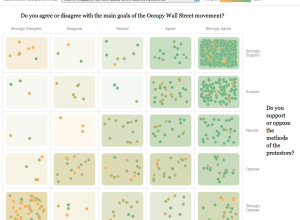
Public opinion of the Occupy movement
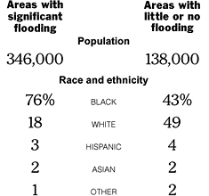
To get a gauge of public opinion and the Occupy movement, The New…
-
FlowingData is brought to you by…
My many thanks to the FlowingData sponsors who help me keep the lights…
-
American migration map
Overhauling his migration map from last year, Jon Bruner uses five year’s worth…
-
Book: The Art of R Programming
R, the favorite computing language of a growing number of statisticians, is friendly…
-
24 hours of Flickr photos printed to fill a room
People upload thousands of pictures to Flickr every day, but the numbers and…
-
Time-lapse of Earth from International Space Station
Beautiful time-lapse video using photographs from crew onboard the International Space Station. I…
-
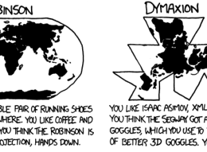
What your favorite map projection says about you
For the map nerds. xkcd says what your favorite map projection says about…
-
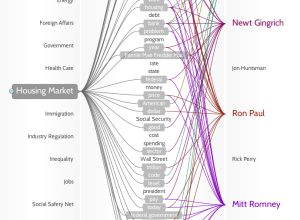
Politilines shows what candidates talk about during debates
If you don’t watch the candidate debates — and let’s face it, that’s…
-
Popular Science data issue
The November issue of Popular Science is a special on data. There are…
-
Link
Figures of Perception →
Concept video for collective data fiction. Interesting if a little fluffy.
-
Visual Résumés
A couple of infographic résumé sites, vizualize.me and re.vu, sprouted up that use…
-
Manual data design from Stefanie Posavec
Designer Stefanie Posavec talks about her process of data collection, analysis, and design.…
-
Link
I have a headache →
The choices you make when picking out medication at the pharmacy. Looks complicated, but of course many of the decisions happen in an instant.
-
Link
Population Control, Marauder Style →
-
Significant digits and relevance
Lulu Pinney goes over the subtle art of working with significant digits:
When… -
A month of swearing in 90 seconds
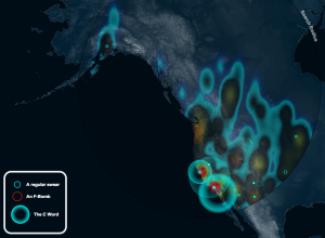
A fun map by Jamie Popkin of Little Earth that animates the use…
-
Telling Stories with Data – VisWeek 2011
Note from Nathan: Last week, visualization researchers from all over gathered in Providence,…
-
Microsoft envisions the near future in technology and interaction
In a follow-up to last year’s visions of the future, Microsoft imagines interacting…
-
How we got to a population of 7 billion
NPR explains how we reached a population of 7 billion. Simply put, the…







 Visualize This: The FlowingData Guide to Design, Visualization, and Statistics (2nd Edition)


