Geography graduate student Derek Watkins has some fun with population densities in an…
Nathan Yau
-
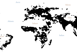
Interactive Islands of Mankind
-
Link
Insight Data Science Fellows Program →
Six-week post-doc training fellowship to form bridges across academia and practice
-
Link
Changing map colors →
The Guardian Datablog posted a choropleth map; readers helped them fix it
-
Link
Census director resigns to Georgetown →
Loss for the Bureau, a gain for the university
-
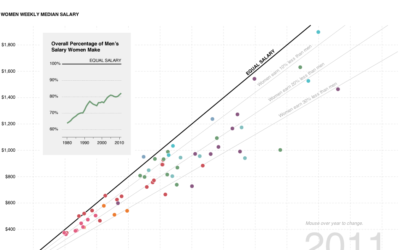
Gender wage gap, how much less women make than men
Three or four articles on the gender wage gap popped up on my radar last week, some focusing on the rise of women as the lead household earner and others on how much less women make. I took a look.
-
Link
Visual Aesthetics →
How they play a role in human-computer interaction and evaluating them
-
Link
Mapping Process →
The steps behind making NYT map in R, showing where Rick Santorum stood before he suspended his campaign
-
A century of ocean shipping animated
Using hand-recorded shipping data from the Climatological Database for the World’s Oceans, history…
-
Link
Text Processing with MapReduce →
From Twitter engineer Jimmy Lin; free download on github
-
Link
Visualizing Twitter →
Roundup of interactives to explore tweets, retweets, and connections
-
Link
What makes good data visualization →
Discussion from a variety of fields, including my adviser
-
Link
Design is a Job →
“Work of the web designer goes well beyond pixel-pushing beautification.” Applies especially well to data designers [via]
-
Too many axes
Kaiser Fung talks about the suck of overlaying plots to show a relationship.…
-
How recruiters look at your resume
In a study by TheLadders (of n equals 30), recruiters looked at resumes…
-
How businesses approach infographics
The Washington Post asked three “young entrepreneurs” how their company uses infographics. They…
-
Link
Why Statistics? →
Seems promising, if you have access to Science
-
Link
Data Stories →
“I have a goal in life: To rid the world of bad PowerPoint slides.”
-
Link
Designing Data Visualizations →
An almost two-hour long, analytics-focused talk
-
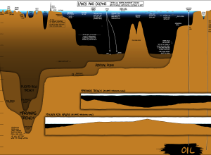
Under the Sea, Under the Sea
In usual xkcd fashion, Randall Munroe plots the depths of lakes and oceans,…
-
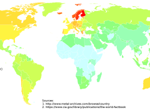
Metal bands per capita
By Reddit user depo_, this map showing metal bands per capita around the…
Recently for Members
Second Edition
 Visualize This: The FlowingData Guide to Design, Visualization, and Statistics (2nd Edition)
 Visualize This: The FlowingData Guide to Design, Visualization, and Statistics (2nd Edition)
New tools, refined process.
Browse by Chart Type See All →


