If you go to the Facebook page for Mitt Romney, note the number…
Nathan Yau
-
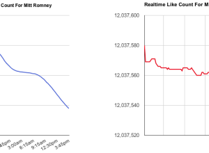
Mitt Romney losing likes on Facebook, in real-time
-
Link
How to fail three tests in one chart →
Design exercise versus straight charts
-

50 percent →
Meta. Is it people’s interest, or is it actually 50 percent of statistics…
-
Members Only

How to Make an Interactive Choropleth Map
When presented with a static graphic, it can be useful to see specific values after you see overall patterns. This tutorial shows you how to add simple interactions to a choropleth map so you can get specifics for regions.
-
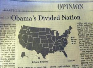
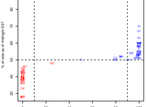
Incredibly divided nation in a map
I knew things were bad, but I didn’t know they were this bad.…
-
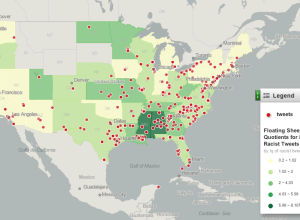
Mapping racist tweets
After seeing this post that highlights racist tweets after the election, Floating Sheep…
-
Data visualization as cultural phenomenon
In 1979, Joy Division released their album Unknown Pleasures, and the cover was…
-
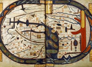
Maps before maps
Amanda Uren has a fun collection of map-like scans from the 11th century.…
-
Link
Why fiction writers should learn math →
About process and details
-
Link
How Nate Silver won the election with Data Science →
How Nate Silver won the election with Data Science. Statisticians won this round.
-
How Silver predictions performed
By way of Rafa Irizarry from Simply Statistics, a plot of Nate Silver’s…
-
Link
What should we expect from Silver? →
At least one state wrong, and likely two or three
-
Tracking the election tonight
As the results roll in tonight, you have plenty of options to keep…
-
Link
Charting Election Night →
NYT graphics has a tumblr for election night
-
2012 political donations mapped over time
Following their animated and narrated visualization on political contributions over time, VisPolitics maps…
-
Link
Wen Family Empire →
Interesting organization to show flow in a network diagram
-
Link
Power outages during Hurricane Sandy →
Opting for a string of images generated in R rather than generate them with SVG/JavaScript
-
Link
1,400 rectangles →
Ratios drawn by a bunch of math teachers
-
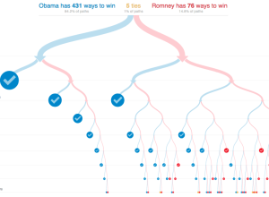
All possible paths to the White House
With the election tomorrow, Mike Bostock and Shan Carter for the New York…
-
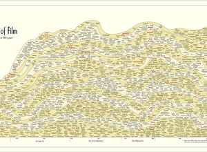
History of film, 100 years in a chart
In something of an homage to the Genealogy of Pop & Rock Music…
Recently for Members
Second Edition
 Visualize This: The FlowingData Guide to Design, Visualization, and Statistics (2nd Edition)
 Visualize This: The FlowingData Guide to Design, Visualization, and Statistics (2nd Edition)
New tools, refined process.
Browse by Chart Type See All →


