The Wall Street Journal visualized major political contributions, according to the Federal Election…
Nathan Yau
-
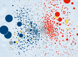
Network of political contributions →
-

Ascii Street View →
Peter Nitsch created Ascii Street View, converting Google Street View to colored letters.…
-
Link
Open Government Data Principles →
Should be complete, timely, not in aggregate
-
Map of connections in the human brain
Using a new kind of MRI scanner, scientists at the National Institutes of…
-

Map of the Internet
Ruslan Enikeev created a searchable Internet map of links and bubbles, showing over…
-

Was an Olympic record set today? →
From the Guardian US, a simple site that tells you if a record…
-

Worldwide mood around London 2012
No doubt there is going to be a lot of tweeting about the…
-
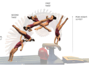
Olympic event nuances explained →
A lot of Olympic events are over and done with in a few…
-
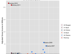
Comparing Romney’s tax returns to presidential returns →
Lee Drutman, a Senior Fellow at the Sunlight Foundation, compared the tax returns…
-
Link
Interactive Spaces →
Google releases API to make rooms digitally interactive
-
Link
Vizify →
Another site to turn your personal data into an infographic. Why?
-
Link
Census API →
It only took a kajillion dollars, but they finally have one
-
Link
Really Big Objects Coming to R →
Maximum vector length making its way to 252; “That’s a lot of McNuggets.”
-
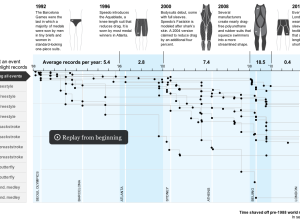
Swimsuit technology and breaking world records
The Washington Post has a fine graphic on swimming world records and the…
-
Link
How to visualise social structure →
Applying new techniques to old Census data
-
Link
Viral infographics and useful visual communication →
Stupid 10-second rule
-
Link
The Future of Big Data
Results from Pew survey on what to look forward to and what not to
-
Link
The Data Stack: A Structured Approach →
Layers of a data-driven application
-
Link
Data science: tools vs. craft →
Data science: tools vs. craft. It takes more than a program to do something useful.
-
From statistics to data science, and vice versa
Carnegie Mellon statistics professor Cosma Shalizi considers the differences and similarities between statistics…
Recently for Members
Second Edition
 Visualize This: The FlowingData Guide to Design, Visualization, and Statistics (2nd Edition)
 Visualize This: The FlowingData Guide to Design, Visualization, and Statistics (2nd Edition)
New tools, refined process.
Browse by Chart Type See All →


