The Washington Post has a fine graphic on swimming world records and the changing swimsuit, from speedo to full rubber body suit.
We expect to see world records fall in Olympic pools. Last time we tuned in, swimsuit technology had progressed so far that human torpedos in rubber suits set new marks almost hourly in Beijing, particularly in shorter events. But times got slower after the suits were banned in 2010, and only one “shiny suit” record has been broken since then in an individual event of 400 meters or less.
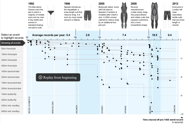
They use a swimming pool metaphor, with the horizontal axis as time, and the vertical axis as the number of seconds shaved off from standing records pre-1998. Each dot represents a broken record, and the gray paths, for each event, indicate how long each record stood for. So when you press play, paths are drawn left to right, top to bottom, and black dots pop up for every new record.
As a standalone animation, the base of this graphic would be fun to watch, but there’s a layer of context and interaction that makes it more interesting.
The illustrations on top provide direction and focus, whereas without them, it’d look a lot like a standard timeline. With them, you get a instant sense of what you’re looking at.
Then when you first press play, the animation pauses at 1996 to give you a short explanation of what you just saw. Click to continue, and labels popup and fade on major events, which serves as a quick explanation of why there were so many broken records all at once.
Finally, once the animation completes, you can use the tabs on the left to highlight paths for specific events. The best time is shown at the end of the path. The only thing left to do is to provide information for each dot (like who the swimmer is), but the focus here is on the patterns of the suit rather than the individual swimmers, so no biggie. Actually, it’s probably better without. Really like this one.
[via @eschow]
 Visualize This: The FlowingData Guide to Design, Visualization, and Statistics (2nd Edition)
I posted a similar visual analysis about a year ago on my blog “The Ivory Sofa” during the 2011 Aquatic World Championships. My viz wasn’t nearly as slick as the Wapo viz and I took a slightly different approach, looking at how the swimsuits effected the fall and subsequent rise of winning times (not just world Records) in international competitions: http://ivorysofa.blogspot.com/2011/07/end-of-swimsuit-wars.html
The graphic and the text make me wonder though….is this just for men’s records?
The way the data is presented is very similar to this “History of World Records” graphic that the NYTimes did back in 2008: http://www.nytimes.com/interactive/2008/08/16/sports/olympics/20080816_world_records.html