Shan Carter and Kevin Quealy for The New York Times updated their housing…
Nathan Yau
-
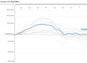
Housing price changes →
-
Link
A Choropleth in QGIS
Xaquín G.V. has a dead simple tutorial on how to make a choropleth map with open source QGIS.
-

Earth’s skies with Saturn’s rings →
Illustrator Ron Miller imagined what Earth’s skies would look like if we had…
-

Statistics jokes
There’s a fun CrossValidated thread on statistics jokes. Here’s the one with the…
-
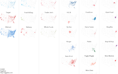
Grocery store geography
I’ve been poking around grocery store locations, courtesy of AggData, the past few…
-
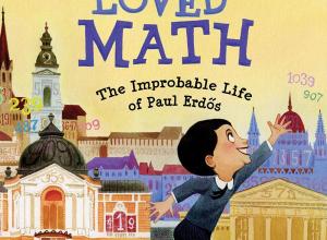
The Boy Who Loved Math →
The Boy Who Loved Math: The Improbable Life of Paul Erdős, written by…
-
Atlas of literal place names
We go places. They have names. What do these names mean though? The…
-

Contrailz: Detailed flight patterns at major airports
Alexey Papulovskiy collected flight data from Plane Finder for a month, which essentially…
-
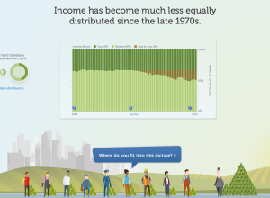
Income inequality, real and personal
In a different take on the income inequality issue, the Economic Policy Institute,…
-
Link
The Insanely Illustrated Guide to Your First Data-Driven TileMill Map
TileMill makes it easy to make custom maps. Here’s a detailed, illustrated tutorial on how to do that.
-
Beer recommendation system in R
Using data from Beer Advocate, in the form of 1.5 million reviews, yhat…
-
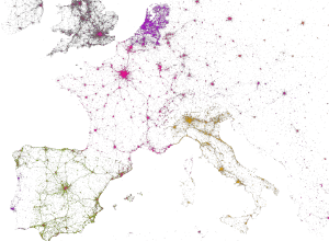
Mapping Twitter demographics
MapBox, along with Gnip and Eric Fischer, mapped 3 billion tweets and a…
-
A high resolution tour of the vegetation on Earth
NOAA visualized global vegetation over a year, and the result is beautiful:
We’ve…
-

Twitter trend detection algorithm
Stuff happens, and people tweet about it. Something major happens, and a lot…
-
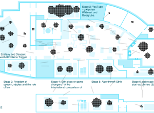
Animation shows flow of attendees during a conference
When you go to a conference, there are typically several talks going on…
-
Link
For Example
Mike Bostock, creator of D3, believes in using examples to show what can be done with his code.
-
Non-statistician analysts are the new norm
As data grows cheaper and more easily accessible, the people who analyze it…
-
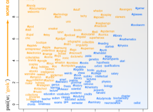
The differences between a geek and a nerd
Curious about how people use “geek” and “nerd” to describe themselves and if…
-
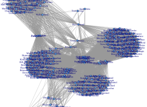
Sniffing out Paul Revere with basic social network analysis
It’s just metadata. What can you do with that? Kieran Healy, a sociology…
-

What the Sexes Want, in Speed Dating
A few years ago I downloaded speed dating data from experiments conducted by…
Recently for Members
Second Edition
 Visualize This: The FlowingData Guide to Design, Visualization, and Statistics (2nd Edition)
 Visualize This: The FlowingData Guide to Design, Visualization, and Statistics (2nd Edition)
New tools, refined process.
Browse by Chart Type See All →


