For the New York Times, Ruth Igielnik and Katherine Chui charted presidential approval…
Statistical Visualization
Finding patterns, distributions, and anomalies.
-
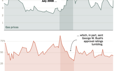
Approval ratings vs. high gas prices
-
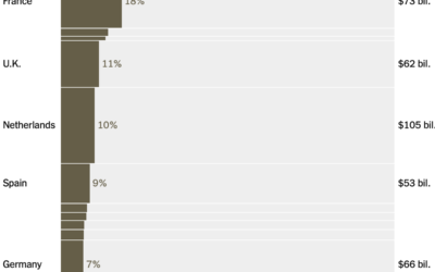
Oil imports from the Middle East, by country
Lazaro Gamio and Josh Holder for the New York Times break down energy…
-
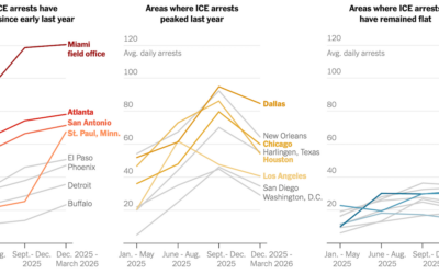
Cities with most ICE arrests
For the New York Times, Albert Sun, Allison McCann, and Hamed Aleaziz obtained…
-
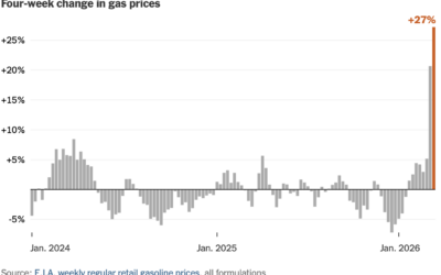
Gas price jump feels like a lot because it is
For NYT’s the Upshot, Francesca Paris gives context to the recent spike in…
-
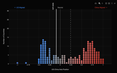
Geopolitical axis between the United States and China
Focaldata calculated United Nations voting patterns by country, relative to the United States…
-
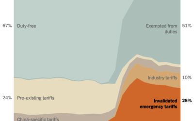
Invalidated tariffs
The U.S. Supreme Court ruled the administration’s “emergency” tariffs to be illegal. This…
-
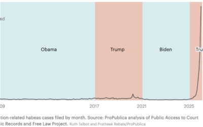
Immigrants challenging their detention in historic number of cases
ProPublica and the Texas Tribune report on the spike of claims over the…
-
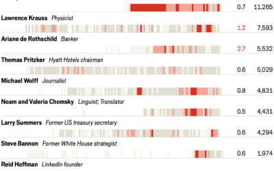
Jeffrey Epstein’s network via 1.4m emails
With the most recent Epstein release, the Economist collaborated with the folks who…
-
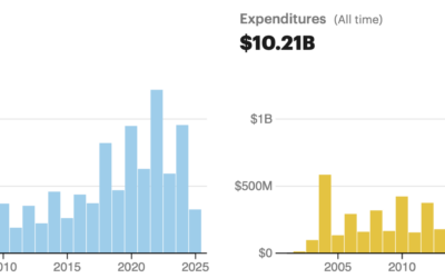
Searchable database of unregulated political contributions
ProPublica updated their explorer for money flowing into 527s.
Every year, hundreds of… -
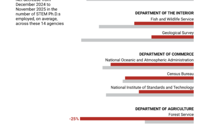
10k fewer STEM PhDs employed by the federal government
Science analyzed employment data from the Office of Personnel Management to calculate the…
-
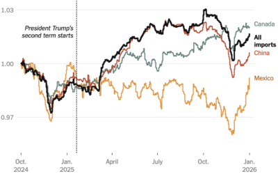
Impact of tariffs on cost of goods
One year into these tariffs, Ana Swanson for the New York Times has…
-
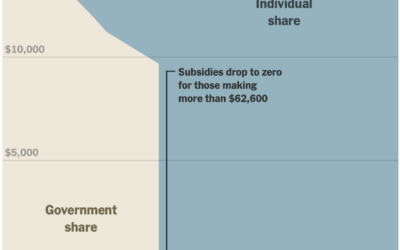
Financial cliff of health subsidies
In January, the scale for U.S. healthcare subsidies changed, which reintroduced a cliff.…
-

Cumulative measles rising with South Carolina outbreak
In 2000, measles in the United States was declared eliminated by the World…
-

Cuts to science and research in the U.S. over the past year
The administration cut science funding, withheld grants, and eliminated jobs in research areas…
-

Pentagon Pizza dashboard to track activities
There is a dashboard for pizza places around the Pentagon.
The Pentagon Pizza… -

How much temperatures increased where you live
He hear global warming and it seems like a monolithic thing that is…
-

Yeah, still getting hotter
You probably don’t need me to tell you this, but recent data suggests…
-

Job cuts for every federal agency
Based on November data released by the Office of Personnel Management, the federal…
Recently for Members
Second Edition
 Visualize This: The FlowingData Guide to Design, Visualization, and Statistics (2nd Edition)
 Visualize This: The FlowingData Guide to Design, Visualization, and Statistics (2nd Edition)
New tools, refined process.
Browse by Chart Type See All →


