Normally there is a steady flow of ships through the strait, but when…
Maps
Intuitive to look at spatial patterns and great for distributing geographic data.
-
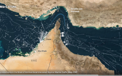
Marine traffic through the Strait of Hormus
-
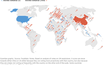
Map of countries aligning with China
Using an analysis from Focaldata, the Guardian used the angled arrow approach to…
-
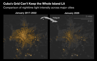
Maps show not enough electricity in Cuba
For Bloomberg, Krishna Karra and Stephen Wicary map blackouts in Cuba due to…
-
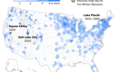
Access to Winter Olympic sports near you
While it’s easy to go out for a run in most places, finding…
-
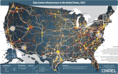
Map of data center infrastructure
More processing power requires more data centers, and for better or worse, they…
-

IsoCity, an open source city building game
If you’re a fan of SimCity, then you’ll appreciate IsoCity, an open source…
-

Mapping 200-mile formation of Chinese fishing boats
For the New York Times, Chris Buckley, Agnes Chang, and Amy Chang Chien…
-

Falling vaccination rates in schools
In some counties, vaccination rates increased after the pandemic, which got them past…
-

Flight patterns when an exploding SpaceX Starship fills the sky with garbage
A SpaceX rocket explosion elicits images of spectacle and maybe thoughts of a…
-

Imagining a global lottery where you are born with less
To highlight challenges in other countries, Giving What We Can imagined a birth…
-

Network of deportation
The current administration is bent on deporting people from the United States. For…
-

Climate change driving home insurance higher
As hurricanes and wildfires grow more common in some areas, home values go…
-

Geologic map of the United States’ surface
The United States Geological Survey published composite maps and data for the country’s…
-

Mapping the most dangerous intersections for pedestrians
For the Washington Post, Ian Duncan, Emmanuel Martinez, and Dylan Moriarty analyzed traffic…
-

Visual reconstruction of flooding at Camp Mystic
The New York Times used a mix of media and data sources to…
-

Scientists can track individual butterflies with tiny sensors
Monarch butterflies somehow fly from Ontario, Canada to Mexico City, but the migration…
-

Shifts back to the left for Hispanic voters
In 2024, Hispanic voters in New Jersey took a hard shift to the…
-

Imagining an extreeeeeme gerrymandered future
Section 2 of the Voting Rights Act prevents states from discriminating by race…
Recently for Members
Second Edition
 Visualize This: The FlowingData Guide to Design, Visualization, and Statistics (2nd Edition)
 Visualize This: The FlowingData Guide to Design, Visualization, and Statistics (2nd Edition)
New tools, refined process.
Browse by Chart Type See All →


