Map of data center infrastructure

Feb 6, 2026

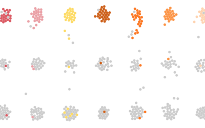
More processing power requires more data centers, and for better or worse, they are going up across the country. Using data from a variety of sources, the National Renewable Energy Laboratory mapped data center infrastructure.

The yellow circles represent operating data centers, orange is construction, and white is proposed. The data centers are connected through transmission and fiber optic lines.

Keep this for when the bots take over and we need to cut the cords in the right places.

Become a member. Support an independent site. Get extra visualization goodness.

See What You Get

Favorites

How You Will Die

So far we’ve seen when you will die and how other people tend to die. Now let’s put the two together to see how and when you will die, given your sex, race, and age.

Divorce and Occupation, in 2015

Some jobs tend towards higher divorce rates. Some towards lower. Salary also probably plays a role.

Sleep Schedule, From the Inconsistent Teenage Years to Retirement

From the teenage years to college to adulthood through retirement, sleep is all over the place at first but then converges towards consistency.

Counting Happiness and Where it Comes From

Researchers asked 10,000 participants to list ten things that recently made them happy. I counted and connected the dots.