In a follow-up to the 2020 project, Moritz Stefaner and Google Trends show…
Results for moritz
-
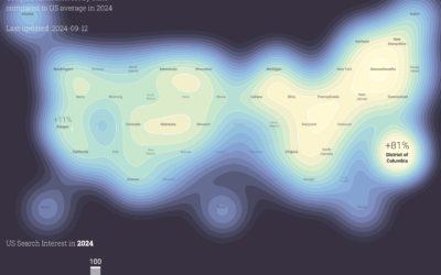
Political search interest in 2024
-
Members Only
Visualization Tools and Learning Resources, June 2025 Roundup
This is the good stuff for June: tools to use, datasets to analyze, and resources to learn from.
-
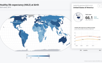
Developing a data design language for the World Health Organization
In a collaborative effort with UX agency Kore, Moritz Stefaner describes work with…
-
Members Only
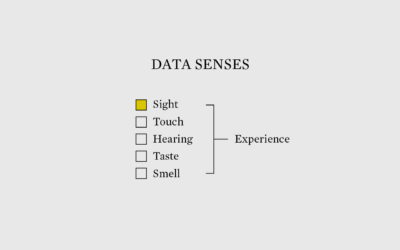
Alternative Ways to Represent Data
We’ve seen data in many forms, but we should dig deeper into using our other senses.
-
Members Only

Visualization Tools and Learning Resources, September 2022 Roundup
Here’s the good stuff for September.
-
Members Only
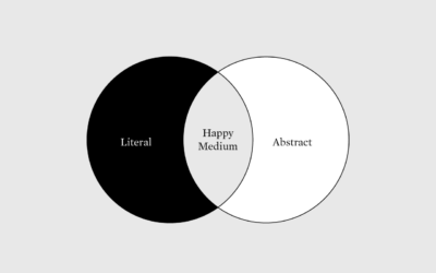
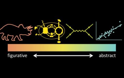
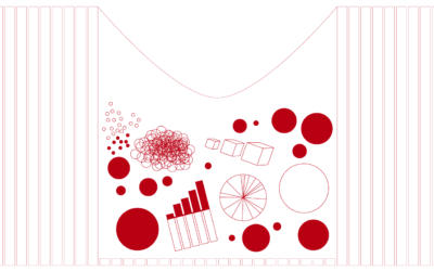
More Literal, Less Abstract
Use visual metaphors to shorten the distance between data and what it represents.
-
Aesthetics
Open to access this content…
-
Members Only
Data Visualization Freelance Advice, from Someone Who Doesn’t Freelance and Has No Clue What He is Talking About – The Process 160
This is the best freelance advice ever written.
-
Members Only

Useful Distractions for Chartmakers – The Process 083
Here are some useful distractions for you as you stay-at-home and wait for an unknown amount of time.
-
Members Only

Uncertain – The Process 079
These past few weeks, and especially this one, has been full of uncertainty. Probabilities, odds, and rates. In this issue of The Process we talk about ways to visualize this uncertainty.
-
Aesthetics
…
-
Members Only
Who Inspired Visualization Practitioners to Become Visualization Practitioners (The Process #51)
For everyone who does data visualization for a living right now, there was someone who came before.
-
Visualizing science
Jen Christiansen spoke about her extensive experience as a graphics editor for Scientific…
-
My chat with Data Stories
I talked with Moritz and Enrico on Data Stories, my favorite visualization podcast.…
-
Members Only
Charting Pitfalls, Flexible Guidelines, Exceptions to the Rules
It can feel like there’s so many rules of visualization that it’s impossible to make a proper visualization. The key: Nothing is absolute.
-

Visualizing the Uncertainty in Data
Data is an abstraction, and it’s impossible to encapsulate everything it represents in real life. So there is uncertainty. Here are ways to visualize the uncertainty.
-
A story of humanity in the pixels of a Reddit April Fool’s experiment
On April Fool’s Day, Reddit launched a blank canvas that users could add…
-
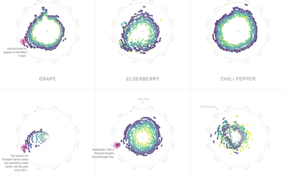
Food patterns
Food trends come and go. Some stay longer than expected, and others come…
-
Visualization as skill set or stand-alone profession
Jumpstarted by Elijah Meeks asking why visualization people are leaving the field for…
-
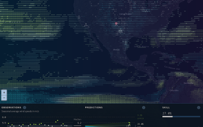
Wind prediction and potential power
As we use up current energy resources, it grows more important to look…
Recently for Members
Second Edition
 Visualize This: The FlowingData Guide to Design, Visualization, and Statistics (2nd Edition)
 Visualize This: The FlowingData Guide to Design, Visualization, and Statistics (2nd Edition)
New tools, refined process.
Browse by Chart Type See All →


