As a resident at Eyebeam, Alexander Chen visualizes the first Prelude from Bach’s…
2011 December
-

Bach Cello Suites visualized
-
On low-quality infographics
This has been sitting in my drafts folder for a few months. Figured…
-
Link
Substratum: A series of inspirational interviews →
A peak into some smart people’s minds, most recently Amanda Cox and Nicholas Felton
-

Visualize This: Signed copies available
Quick announcement: I have a handful of signed Visualize This copies available in…
-
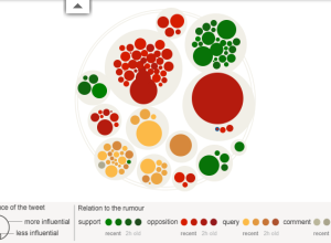
Rise and fall of riot rumors on Twitter
During the riots in London this past summer, a lot of information spread…
-
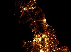
Every death on the road in Great Britain
As part of their series on road accidents, BBC News mapped every recorded…
-
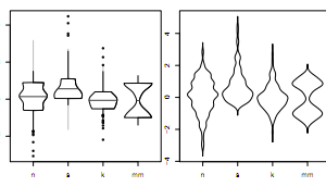
40 years of boxplots
Famed statistician John Tukey created the boxplot in 1970. It shows a distribution…
-
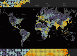
What seven billion people looks like
Form design intern at Fathom, James Grady, maps population density in Dencity:
Dencity… -

Smiley installation shows the mood of a city
Project Stimmungsgasometer (say what?) is a giant smiley face that changes based on…
-
Shan Carter on data storytelling
Shan Carter, who makes interactive graphics for The New York Times, talks telling…
-
Link
How infographics jumped the shark →
Don’t worry. This isn’t the end of the world.
Recently for Members
Second Edition
 Visualize This: The FlowingData Guide to Design, Visualization, and Statistics (2nd Edition)
 Visualize This: The FlowingData Guide to Design, Visualization, and Statistics (2nd Edition)
New tools, refined process.
Browse by Chart Type See All →


