What do you think about the above graphic? Good, bad? Effective, or not?…
2009 March
-
What Do You Think of This Evolution Graphic?
-
your.flowingdata: Collect Data About Yourself via Twitter
As many of you know, I’ve been working on a project that lets…
-
Crisis of Credit Explained in Animated Infographics
This video (below) explains how we got into this credit crisis. It’s a…
-

Because It’s Friday: Correlation
It’s time like these I feel like one big nerd.
[xkcd | Thanks,… -
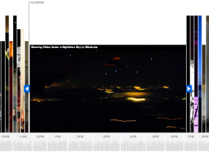
Explore Flickr Videos On Flickr Clock by Stamen Design
Stamen Design, whose work you’ve most definitely seen, comes out with their most…
-
Nokia Collaborates With Generative Artists for Beautiful Interactive Pieces
In collaboration with generative artists Marius Watz, field, and others, along with Universal…
-
Phew, FlowingData 10k Giveaway is Done!
Our 10k giveaway is now complete. Congratulations to all the winners, and a…
-
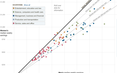
Paycheck Gap Between Men and Women – Guess Who Makes Less
Hannah Fairfield and Graham Roberts from The New York Times show the disparity…
-
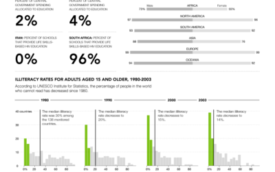
Progress: A Graphical Report on the State of the World
You might recall that the United Nations Statistics Division launched UNdata about one…
-
Four hours and then we’re done…
If you haven’t won anything in our 10k giveaway yet, there’s about 4…
-
Microsoft’s Vision for 2019 is Data Visualization
Google’s chief economist tells us statistician will be the sexy job of the…
Recently for Members
Second Edition
 Visualize This: The FlowingData Guide to Design, Visualization, and Statistics (2nd Edition)
 Visualize This: The FlowingData Guide to Design, Visualization, and Statistics (2nd Edition)
New tools, refined process.
Browse by Chart Type See All →


