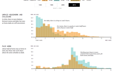
Last year, in 2019, my main goals for FlowingData and work were to stay focused and make charts. I was satisfied with my progress, and for 2020, I had hoped to step that up with more depth and more play.
But you know what happened. The year was challenging for many reasons, and it was hard to concentrate or to think of much else other than the day’s current events.
I’m lucky to be able to work from home though, and I am thankful for that. So FD was able to roll on.
As I do every year, I like to bookend with an annual review, so here we go.
Most Viewed
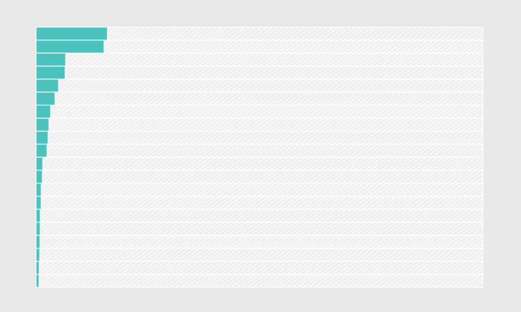
These are the most viewed projects from 2020:
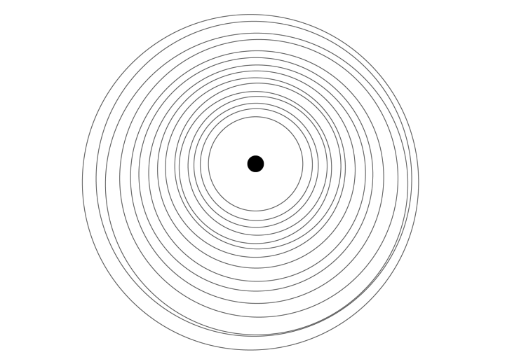
- Guessing Names Based on What They Start With — The year started off strong with this fun interactive that guessed your name, based on when you were born.
- Toilet Paper Calculator — Remember when the most pressing threat seemed to be that you might run out of toilet paper? I made a straightforward calculator so you would know how much to buy (and how much to leave others).
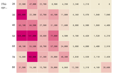
- Finding the New Age, for Your Age — Life expectancy improves (it was), so I wanted to know how your age corresponded to life expectancy of the past. (It also looked like we were rounding a corner with the pandemic in August.)
- Chart Types — I’ve been cataloging FD posts by chart type for a while but never made it obvious. Now you can see them all in the same place.
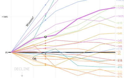
- Redefining Old Age — I was getting curious again. 2020 had other plans.
FD is largely an extension of my mundane curiosities played out in data form. The challenge this year was that the data questions were on constant repeat. How much longer? Now what? What, no, why? I looked at plenty of Covid-19 data but promised myself I wouldn’t make any of those meanderings public.
So the projects I worked on this year were mostly me trying to find order or looking for a distraction. You can only bake so much bread.
The Process

The weekly newsletter for FD members kept going (if a bit shorter than in the past). I published issue 120 last week. It’s hard to believe I’ve been writing it for over two years now (plus the monthly tool roundups), but here we are.
These are my favorites from the year:
- Data, the Fuzzy and Fragile Representation of Real Life
- Contrast
- Improving the Georgia Cases Chart
- Uncertain
- A Better Chart, Limitations Considered: Exit Poll Results
I’ve never been more confident about how data is intertwined with our daily lives, which crossed over into the newsletter somewhat unintentionally.
A New Course on Visualization for Clarity
I wrote a new self-guided course on visualization for clarity. I announced it briefly in The Process but never announced it on the blog proper. It never seemed like the right time to talk about it I guess?
Well, here it is. It’s tool-agnostic and focused on designing data visualization for an audience.
Tutorials
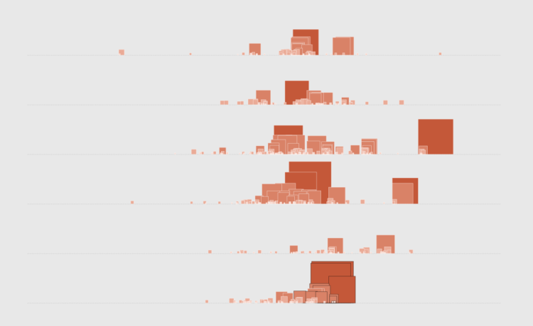
More tutorials were added to the collection this year. There are now 132 in-depth tutorials covering many chart types and a mix of tools (but mostly still R).
I was hoping to carry the momentum from 2019 into 2020, enlisting other skilled visualization folks to bring their own perspectives and new tools — Excel, ggplot, Python, JavaScript — but again, it was a weird year. I’m going to lean into this more next year.
That’s about it. Thank you for reading and an especially big thank you to members who support my work and FlowingData. This was the second full year as a completely member-supported site, and I’m thankful that this is what I get to do.

