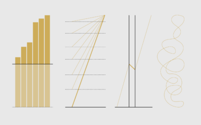
This is a guide to protect ourselves and to preserve what is good about turning data into visual things.
misleading
-
Defense Against Dishonest Charts
-
Members Only
Misleading or Not? A Chart About How Couples Meet
If a chart is seen by enough people, someone will call it misleading. There are no exceptions.
-
Members Only
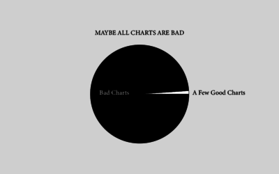
Maybe All Charts are Bad – The Process 131
But probably not.
-
Members Only
The Process 107 – Misleading or Not? A Map of US Fires
Welcome to another edition of Misleading or Not, where we decide if a map is misleading or not.
-
Members Only
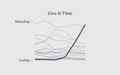
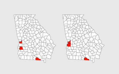
Maybe They’re Just Not Good at Charts Yet (The Process 099)
This week, people were taking a closer look at the Georgia Department of Public Health’s Covid-19 status page (again), which led to an unnecessary pile-on.
-
Members Only
Misleading or Not? A Chart Showing Coronavirus Fatality Rate (The Process #75)
Welcome to another episode of Misleading or Not? where we look at a chart and decide if it’s misleading or not.
-
Members Only
Misleading Map, or Misinterpreted? (The Process #72)
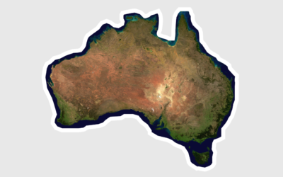
A 3-D rendered map of Australia depicting a month of bushfires grew popular last week. Some thought it misleading. Others thought it was okay. It’s probably somewhere in the middle of that.
-
How Charts Lie
Charts can reveal truths that we never would see otherwise, but they can…
-
Members Only
This is Misleading, This is Not Really Misleading
The truth is that all charts are misleading. In some sense. The key is minimizing how much.


 Visualize This: The FlowingData Guide to Design, Visualization, and Statistics (2nd Edition)


