 Mint was released last week. It’s an online application that brings financial data from all of your credit card and bank accounts into one place. Think Quicken online and free.
It’s super easy (only takes a few seconds) to add your financial accounts, and you only have to do it once. After you’ve added your accounts, Mint will update your data every night and compile them into useful reports. You’ll get an overview of spending trends, transactions, and even ways you can save money based on your current credit cards’ interest rates.
So far I’ve found it useful simply because all of my data is one place. As I’ve made my way into adulthood, I’ve slowly accumulated more and more credit cards to the point where it’s kind of annoying to login to every account to see how much debt I have.
One Small Annoyance
My one gripe about Mint is that the spending trends and savings features haven’t been that informative, but I imagine will get better once more data comes in and Mint continues to tweak the system. My highest hope is that they do something about the dreaded 3-d pie chart…
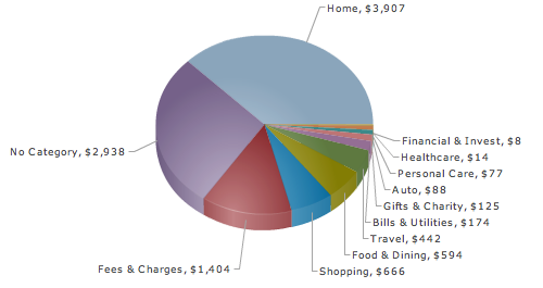
Overall though, I’m looking forward to seeing Mint grow and develop into an extremely useful tool that brings all of your data into one place and represents it in a way that’s understandable and interesting.


 My roommate pointed out a couple of weeks ago that I always get Chinese takeout for dinner; however, we never get home at the same time, and most days, she’s not even in the apartment when I arrive. How could she, a very bright and educated individual, come to such a conclusion after seeing so little data?
 I’m thinking it might be time to revive my step count data collection with a nifty
  For those interested in or who already use
  With a stricter border patrol, more Mexican illegal immigrants are taking dangerous routes to get into the United States. As a result, treks through the dehydrating Arizona desert have caused a significant number of
 If you’ve read any books on visualization, without a doubt, you’ve seen John Snow’s now famous cholera map. In 1854, people were dying in large numbers and high frequency, but nobody knew what was going on. John Snow

 Visualize This: The FlowingData Guide to Design, Visualization, and Statistics (2nd Edition)