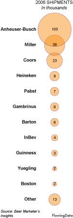
 Anheuser-Busch (Budweiser), Miller, and Coors lead the way in beer. Albeit, this is shipment data, not sales data, so take the numbers with a grain of salt.
The extreme dominance of the top three American beers was somewhat surprising to me, because I never see people order any of those three at restaurants. However, I gave it a few more seconds of thought. I’m thinking parties, sporting events, and drunken nights. The American beers go down easier (because they’re like water), so it’s easier to get drunk. To get drunk, people drink more. So I guess the watery dominance isn’t that surprising. I guess when people buy beer for taste at restaurants, they look to different brands.
Anyhow, I’m really starting to become a fan of these bubble charts. They’re really easy to read and can quickly spruce up a hard-to-read table of numbers. They also seem to scale decently. By well, I don’t mean in like the thousands, but in the tens, I think the bubbles can hold their own.
What kind of beer do you prefer?
 One of the things I miss most about going to school is hanging out with my cohort. I work from home in Buffalo, and I get bored and restless pretty easily. When I was at school and feeling restless, I could just go down to the stat lounge, sit on the ridiculous-looking Ikea couch, and relax with some classmates. We never sat around and talked about probability theory or the law of large numbers (ok, maybe we did sometimes), but because we were all stat students, we all had this data-ish way of thinking. Know what I mean?


 My roommate pointed out a couple of weeks ago that I always get Chinese takeout for dinner; however, we never get home at the same time, and most days, she’s not even in the apartment when I arrive. How could she, a very bright and educated individual, come to such a conclusion after seeing so little data?
 I’m thinking it might be time to revive my step count data collection with a nifty
  For those interested in or who already use
  With a stricter border patrol, more Mexican illegal immigrants are taking dangerous routes to get into the United States. As a result, treks through the dehydrating Arizona desert have caused a significant number of
 Visualize This: The FlowingData Guide to Design, Visualization, and Statistics (2nd Edition)


