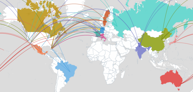
 Data is everywhere, but use of data is not. So many of our efforts are centered around making money or getting people to buy more things, and this is understandable; however, there are neglected areas that could actually have a huge impact on the way we live. Jake Porway, a data scientist at The New York Times, has a proposition for you, tentatively called Data Without Borders.
[T]here are lots of NGOs and non-profits out there doing wonderful things for the world, from rehabilitating criminals, to battling hunger, to providing clean drinking water. However, they’re increasingly finding themselves with more and more data about their practices, their clients, and their missions that they don’t have the resources or budgets to analyze. At the same time, the data/dev communities love hacking together weekend projects where we play with new datasets or build helpful scripts, but they usually just culminate in a blog post or some Twitter buzz. Wouldn’t it be rad if we could get these two sides together?
Yes. It would be rad. If you’re an NGO looking for help or a data hacker with a desire to provide some, sign up to the mailing list, and help Jake get the ideas rolling.
[Doing Good With Data via @ireneros]
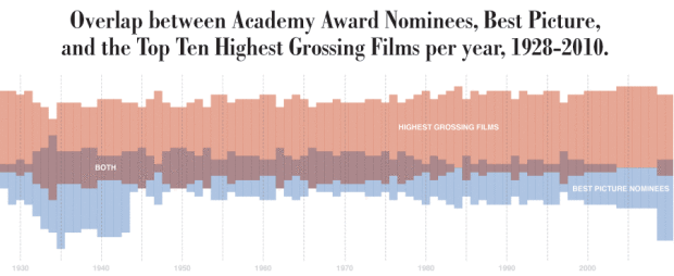
 While information graphics have been around for decades, their current form is brand new (or kind of old, if you’re counting in Internet years). Just like the Web, information and data graphics will continue to evolve in line with improving technology and growing amounts of data.

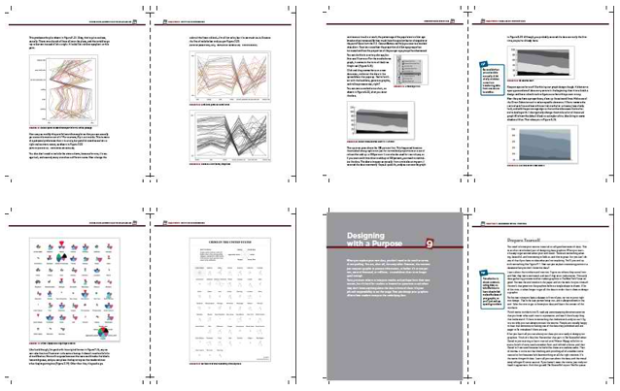


 Visualize This: The FlowingData Guide to Design, Visualization, and Statistics (2nd Edition)


