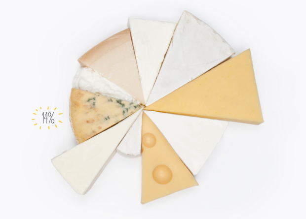
• Making use of data from the Federal Election Commission and The New York Times Campaign Finance API, ProPublica takes a closer look at where campaign contribution is going.

    Many have been detailing the vast sums being raised by the presidential candidates and the super PACs supporting them. But where are all those millions being spent? Among other things, the answers can provide hints on potential improper coordination between campaigns and super PACs. Here are the 200 biggest recipients of spending by the major campaigns and most of the major super PACs.

    It’s a sankey diagram with campaigns and Super PACs on one side and payees on the other. (I rotated the image above clockwise.) Select a campaign to see what they’ve spent their money on, or select a payee to see who’s paying them. As I browsed through payees, my next question was what these companies, organizations, and people do since $377,222 from Obama for America to a company called PDR II DBA Share Share doesn’t mean much to me. I haven’t looked at FEC data in a while, but I vaguely remember a way to categorize spending.

    Find more information on the making of this graphic here.

  • Using a computational model called Estimating the Circulation and Climate of the Ocean, Phase II (ECCO2), the NASA Goddard Space Flight Center Scientific Visualization Studio (I think NASA has a thing for long names.) visualizes surface currents around the world. This is beautiful science here. Make sure you turn on high-def and go full screen. [via @aaronkoblin]

  • Jon Bruner of Forbes, in collaboration with Hilary Mason and Anna Smith of Bitly, maps the most popular news source by state.

    Bitly’s dataset, wrangled by data scientists Hilary Mason and Anna Smith, consists of every click on every Bitly link on the Web. Bitly makes its data available publicly—just add ‘+’ to the end of any Bitly link to see how many clicks it’s gotten. For Bitly’s collaboration with Forbes, Smith and Mason looked for news sources and individual articles that were unusually popular in certain states compared to national averages. The interactive map starts by showing which news source dominates in each state by this measure: the Washington Post in Virginia and Maryland, the Chicago Tribune in Illinois, and so on.

    You can also select news sources to their click distributions across the country.

    I like how The Onion leads in Minnesota, Wisconsin, and New Mexico, although I’d be interested to know what other news sources the states read. A color scale might be informative, too.

  • Just choose the location you want via the Google Maps interface, pick what materials you want, and Woodcut Maps puts your map through the laser cutter and assembles and packs your map by hand. Great gift idea or a nice little something to set on your desk.

  • Designer Matt Dempsey explains the storyline of Inception in this fun experiment. There were a few flowcharts that came out when the movie did, including one from Christopher Nolan, but this one takes the cake. Just keep on scrolling down to move through levels, and people (the colored circles) disappear and reappear as people go in and out of dreams and limbo.

  • Adam Savage of Mythbusters gives a short talk on simple ideas leading to complex findings. Good. “Just thought a little bit harder” and “were a bit more curious.”

  • Essentially, all models are wrong, but some are useful.
    — George E. P. Box, Empirical Model-Building and Response Surfaces, 1987

    A favorite quote among statisticians.

  • Whoa. What did I just read?

    I think most of you know of Freakonomics, but in case you don’t, it started as a book in 2005, by economist Steven Levitt and journalist Stephen Dubner. The book examines corners of life (like cheating in sumo) through data. It’s a good read. SuperFreakonomics was the follow-up in 2009. Freakonomics has since grown up into a media company, complete with documentary, radio show, and blog. Needless to say, it’s had a lot of success.

    In the latest issue of American Scientist, statisticians Kaiser Fung and Andrew Gelman wrote a strong critique of Levitt and Dubner’s work.

    In our analysis of the Freakonomics approach, we encountered a range of avoidable mistakes, from back-of-the-envelope analyses gone wrong to unexamined assumptions to an uncritical reliance on the work of Levitt’s friends and colleagues. This turns accessibility on its head: Readers must work to discern which conclusions are fully quantitative, which are somewhat data driven and which are purely speculative.

    Fung and Gelman then cite examples that they believe erroneous.

    It’s not mean-spirited, but Gelman has a way of offending even if he doesn’t mean to, so I knew a third of the way through that this could not end well.

    Dubner replied. (Skip part II, which addresses a different issue that shouldn’t have been an issue in the first place.) He assesses — after explaining why almost everything that Fung and Gelman wrote is wrong — that they were blinded by their want to disprove.

    [O]nce they’d picked up a hammer, did everything look like a nail?

    Dubner continues:

    I can certainly understand why Freakonomics is an appealing target for someone like Gelman-Fung. As I noted earlier, there are strong incentives to attack, particularly in the public sphere, where one can get a ton of attention in a blink by assailing the reputation of someone who’s been plugging away for years. Whether in the academy, the media, the political arena, or elsewhere, public discourse these days often seems little more than a tit-for-tat game in which you wait for someone or something to achieve a certain momentum and then shout as loudly as you can that it’s “wrong!” Or, in written form: Epic fail.

    I’ve only read the first book, which like I said was really good, so I can’t really go with either side, but Dubner provides some compelling arguments, and I have a feeling most people will believe him more.

    Update: Gelman replies to the reply and Fung adds to that.