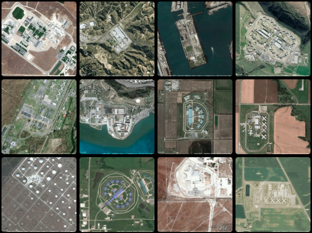
New York University graduate student Josh Begley grabbed 4,916 satellite images of prisons via the Google Maps API and put them all in one place. It’s called Prison Map.
The United States is the prison capital of the world. This is not news to most people. When discussing the idea of mass incarceration, we often trot out numbers and dates and charts to explain the growth of imprisonment as both a historical phenomenon and a present-day reality.
But what does the geography of incarceration in the US actually look like? Prison Map is my attempt to answer that question.
Most are isolated boxes surrounded by a lot of field, but oddly there are some in close proximity to residential. There’s one towards the bottom that actually does look like a residential area. Either it’s a blip or grandma is running a prison in the basement. Probably the former.


 Visualize This: The FlowingData Guide to Design, Visualization, and Statistics (2nd Edition)

I think that someone forgot to QA the images before they were posted to the site. In one I saw Lucas Oil Stadium and while many of the players in the NFL may belong in jail, I am not sure that this is a real prision. In other images I saw an oil field and a airport. So while many of the images may be actual prisions, it is clear that they need to take a closer look at the data. In addition it would be nice if they included the location so that visitors of the site could take a closer look themselves.
I remember doing this a few weeks ago. Interestingly (although I suppose not shocking) there are often cemeteries located right next to the prisons.
are the jails with lots of trees where the rich bankers go?
If only there were tool tip labels to tell us what we’re looking at.
–Shawn
I agree with Shawn, It would be great it some data about each site popped up with the larger image on mouse-over. It would be even better if it was a map and geographically-ordered in addition