• Birds move. eBird shows us how.

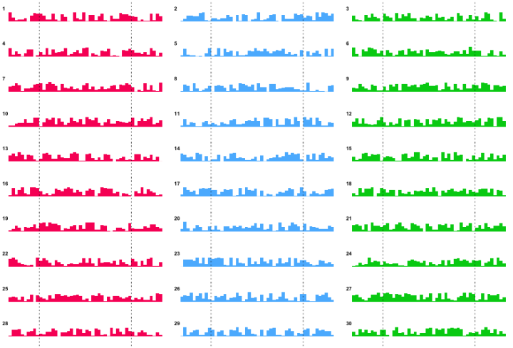
    Understanding patterns of bird occurrence at continental scales has long been one of eBird’s fundamental challenges. Only now, with 42 million records and ever more thorough coverage nationwide, is this becoming possible. Ongoing research at the Cornell Lab is currently producing cutting-edge graphics that we are pleased to share here. Day-by-day predictions of species occurrence allows these models to shine a spotlight on the most awe-inspiring of natural spectacles: the ebb and flow of bird migration.

    Cutting edge? No. They are thorough though, with maps (in the form of animated gifs) for a large number of species.

    [eBird | Thanks, Ed]

  • Diego Valle-Jones maps homicides and trafficking routes in Mexico.

    To unclutter the map and following the lead of the paper Trafficking Networks and the Mexican Drug War by Melissa Dell, I decided to only show the optimal highways (according to my own data and Google Directions) to reach the US border ports from the municipalities with the highest drug plant eradication between 1994 and 2003 and the highest 2d density estimate of drug labs based on newspaper reports of seizures. The map is a work in progress and is still missing the cocaine routes, but hopefully I’ll be able to add them shortly.

    There’s lots to look at and interact with here. To start, there are bubbles that cluster homicides by region and major highway routes in black.

    Click on any bubble and you get a time series for the corresponding area, going back to 2004. Or if you like, draw your own polygon to see the time series for specific regions. Pointers on the time series highlight significant events. There’s also a slider that lets you see numbers on the map for different years. A layer underneath the bubbles lets you see high density areas for marijuana, opium, and drug labs.

    Take a look at the full map for yourself. This is nice work by Valle-Jones.

    [Diego Valle-Jones | Thanks, Diego]

  • You would think that something so concrete, carefully recorded by authorities, wouldn’t be too tough to tabulate, even if at a large scale. Not so.

    Homicide is a “serious crime that many people are concerned with, it is well-measured, and it is to a large degree well-reported and -recorded,” says Alfred Blumstein, a criminologist at Carnegie Mellon University. “That is not to say that there aren’t a variety of ways for fudging the measurement.”

    Among the factors that cloud homicide numbers: gaps between police-reported numbers and counts by public-health organizations. The discrepancy is wide in many African countries and some Caribbean ones. The United Nations attributes the disparity to several factors, including definitional differences—whether honor killings should count—a lack of public-health infrastructure in some countries, and undercounting—possibly deliberate—by police.

    I think this is something the common public often doesn’t understand about data. The numbers are entered and analyzed on a computer, so it’s easy to mistake data for mechanical output. It must be accurate, right? That’s usually not the case though, especially when it comes to data collection outside a controlled lab setting.

    The game always changes when humans are involved. Not everyone responds to surveys, definitions of events vary across organizations, estimation methods change every year, and the list goes on.

    For those who do stuff with data, you have to deal with that uncertainty, and as data consumers, you have to remember that numbers don’t automatically mean fact.

    [Wall Street Journal]

  • I thought this riveting post on the New York Times Bits blog about the rise of the toilet texter deserved a graphic. Since their graphics department is no doubt busy with elections, I took the liberty. I am — the 91 percent.

    I got the numbers straight from the Bits post, but you can download the full report from 11mark for all the demographics. You have to register though, and I didn’t want to be the guy who creates an online account to just read a report on what people do while they make dooty. I have standards.

  • Yahoo is not what it used to be, but many parts of it are still alive and well. In a follow-up to their email interactive, Yahoo, along with visualization firm Periscopic, explores the popularity of articles that appear on the Yahoo homepage. It’s a visualization that shows activity within the Content Optimization and Relevance Engine (C.O.R.E. for short).

    The focus is on the center, which has the same layout as that of the stories on the Yahoo homepage. Story on top, and links to more stories on the bottom. Except in the interactive, you can see demographics of those who viewed the story. The slider on the bottom lets you go back up to 24 hours to see what was hot during each hour.

    It gets more fun when you use the buttons on the left and right to view popular stories among age and gender cohorts and button on the right that let you see stories by categories. The rotating particles, each representing a clickable story, in the background provide a final flourish.

    Oh, and extra nerd points for HTML5.

    [Yahoo]

  • Data is hot right now, so as you would expect, more people are signing up and applying to learn about it. Quentin Hardy for The New York Times reports.

    At North Carolina State, an advanced analytics program lasting 10 months has, since its founding in 2006, placed over 90 percent of its students annually. The average graduate’s starting salary for an entry-level job is $73,000. Its current class of 40 students had 185 applicants, and next year’s applications are already twice that. In 2009, Harvard awarded four undergraduate degrees in statistics. Two graduates went into finance, one to political polling and one became a substitute teacher. There were nine graduates in 2010, 13 last year. They headed into Google, biosciences and Wall Street, as well as Stanford’s literature department.

    And in 2011, just about everywhere.

    [New York Times via @jsteeleeditor]

  • Priceonomics takes the association of fixie bikes to hipsters, and creates the Fixie Bike Index. After starting with New York, they branch out to national numbers.

    In short, fixed gear bikes = hipsters, and New York boroughs that have more fixies per capita should have more hipsters per capita. We sampled our data to see the number of used bikes for sale per capita in each borough with the term “fixie” or “fixed gear” in the product title to create the Fixie Index.

    I don’t know about these numbers. I lived in Modesto for a year and don’t remember people riding bikes — or hipsters, and riding your bike in Los Angeles kind of sucks.

    [Priceonomics]