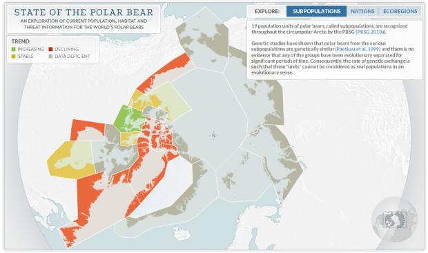
• Using the same tech Martin Wattenberg and Fernanda Viegas created to show wind flow, the NOAA Great Lakes Environmental Research Laboratory mapped water flow in the Great Lakes, based on forecasting simulations.

    The “Latest” and “3hrs Previous” visualizations depict water motion corresponding to a snapshot of lake currents at the present time and three hours previous to the present time. Lake currents can change rapidly with changing wind conditions.

    Surface currents tend to follow the wind direction more closely than currents at depth. Depth-averaged currents represent the average water motion from surface to bottom and tend to follow shoreline and bottom contours.

    The default map is semi-live, but you can also see flows for previous months. For example, the patterns during February 2011 are kinda cool, with a lot of swirling and well-defined currents.

  • If you want to learn visualization, you should learn data. To learn data, you should learn statistics. Where to begin? The free analysis courses offered on Coursera, by Johns Hopkins professors is probably a good place to start. Currently available: Computing for Data Analysis with biostatistics professor Roger D. Peng and Data Analysis with Jeff Leek, also a biostatistics professor.

    There’s also a handful of data-related courses from other university professors that might be worth a look.

  • Designer Matthew Olin unmasked the characters behind the typeface characters for his MFA thesis. Others include sans serif as Batman, slab serif as the Hulk, and handwriting as the Flash.

  • Geographers James Cheshire and Oliver O’Brien visualized life expectancy in London as a tube map.

    Whilst the average life expectancy predictions show that today’s children are expected to live longer, the range is startling. For the stations mapped, it is over 20 years with those around Star Lane (on the DLR) predicted to live, on average, for 75.3 years in contrast to 96.38 years for those around Oxford Circus. The smaller disparities are no less striking. For example, between Lancaster Gate and Mile End (20 minutes on the Central line) life expectancy decreases by 12 years and crossing the Thames between Pimlico and Vauxhall sees life expectancy drop by 6 years. The stations serving the Olympic Park fair badly and contrast with the Olympic volleyball venue at Earl’s Court whose spectators will be passing through areas with far higher life expectancies and lower child poverty

    The tube map metaphor is typically a stretch, in line with the periodic table of whatever, but this actually works. [via Guardian]

  • Art shop Dorothy made a map with film titles for street names.

    The Map, which is loosely based on the style of a vintage Los Angeles street map has its own Hollywood Boulevard and includes districts dedicated to Hitchcock and Cult British Horror movies. Like most cities it also has its own Red Light area. There’s an A-Z key at the base of the Map listing all the films featured with their release dates and names of the directors.

    I was hoping for a little more than places labeled with movie names, but still fun.

  • I get accused of witchcraft all the time, so naturally this flowchart by Lapham’s Quarterly was of interest. Malleus Maleficarum is an actual thing, by Heinrich Kramer and Jacob Sprenger, that was written to be the official authority to prove the non-existence of witchcraft.

  • The Eyeo Festival, hosted over at the Walker Art Center in Minneapolis, seems to have grown quickly into the event of the year for data artists and designers. Scan the speaker list, and you’ll recognize a lot of names, like Cox, Felton, Thorp, and Fry. This year’s event has come and gone, but the talks have been trickling online. You should watch them.

    Start with the keynote by Paola Antonelli, a senior curator in the Department of Architecture and Design at the Museum of Modern Art, jump to the five-minute ignite talks, and then slowly take in the rest.

  • Derek Thompson for The Atlantic on how retail uses our numeric biases to their advantage:

    Now that I’ve just told you that consumers try to avoid additional payments, I should add that there are two additional payments we love: rebates and warranties. The first buys the illusion of wealth (“I’m being paid money to spend money!”). The second buys peace of mind (“Now I can own this thing forever without worrying about it!”). Both are basically tricks. “Instead of buying something and getting a rebate,” Poundstone writes, “why not just pay a lower price in the first place?’

    “[Warranties] make no rational sense,” Harvard economist David Cutler told the Washington Post. “The implied probability that [a product] will break has to be substantially greater than the risk that you can’t afford to fix it or replace it. If you’re buying a $400 item, for the overwhelming number of consumers that level of spending is not a risk you need to insure under any circumstances.”

    Other tidbits: our obsession with prices ending with a nine and how we justify purchases of things that are more expensive but aren’t necessarily better than the cheaper item.