The New York Times mapped ratings for members of Congress, as given by the NRA.
The National Rifle Association gives members of Congress a grade ranging from A to F that reflects their voting record on gun rights. But in response to the school shooting, some pro-gun Democrats have signaled an openness to new restrictions on guns, and the N.R.A. released a statement that said it was “prepared to offer meaningful contributions to help make sure this never happens again.”
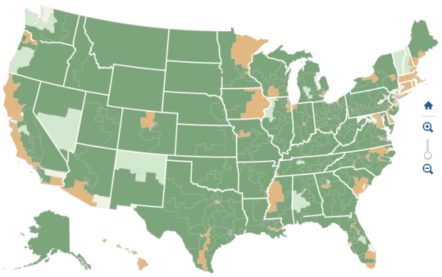
 From businesses to demographics, there’s data for just about anywhere you are.

 Visualize This: The FlowingData Guide to Design, Visualization, and Statistics (2nd Edition)


