It’s another label-your-axes joke from SMBC. Yep, still funny.
-
-
-
-
This month the Netherlands held national elections, and now that the results are in, interaction designer Jan Willem Tulp had a look at voting similarity between cities. I’m not sure what metric was used to judge similarity, but it looks like it was based on voting distributions for candidates.
Each circle represents a city, and you can choose between a geographic layout or a radial one. When you select a circle, the others change size and color, where more red and larger means more similar. In the radial layout, circles that are farther are away are less similar. Be sure to look at the city of Urk in the radial layout. According to Tulp, it’s the most religious city, and it votes completely differently from the rest. [Thanks, Jan]
-
-
-
-
-
The Forest of Advocacy is a series of animations that explores the political contribution patterns among eight organizations, such as Bain Capital, Goldman Sachs, and Harvard Business School.
These visualizations provide a dynamic look at the partisan tilt of giving within organizations. For each organization, individuals are characterized as points sketching out a line over time. The X axis is time, and the Y axis represents the net partisan tilt of contributions over the preceding 6 months. Over the decades, one sees lines sketched out, reflecting the partisanship of individuals over time. For each organization, we also provide the net contributions of the entire organization, and the names of biggest Democratic, Republican, and “bipartisan” contributors (the individual with the highest product of Democratic and Republican contributions).
At the core, each animation is a time series chart, but the aesthetic and animation, which is narrated, provides for a more organic feel. In particular, the movements of people, represented by squares shifting straight across or up and down, makes it easy to see consistent and not so consistent contributions. [Thanks, Mauro]
-
-
-
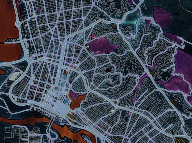
Aaron Rueben and Gabriel Isaacman used data from sampling air in tunnels, where there are a lot of cars, to create unique soundscapes that represent the chemicals in the area.
We created sounds from air samples (atmospheric particulate matter collected on filters) by first using gas chromatography to separate the thousands of compounds in the air (try it with markers at home) and then using mass spectrometry, which gives us a unique “spectrum” for chemicals based on their structure, to identify the compounds and assign them tones. Some compounds end up sounding clear and distinct, while others blur together into unresolvable chords. The result is a qualitative, sensory experience of hard, digital data. You can actually hear the difference between the toxic air of a truck tunnel (clogged with diesel hydrocarbons and carcinogenic particulate matter) and the fragrant air of the High Sierras.
The audio above represents the air in the Caldecott Tunnel Oakland, California. Note the heavy hydrocarbons towards the end. Contrast that with the audio for a remote forest in the Sierras below.
-
Emily Chow, Ted Mellnik, and Karen Yourish for The Washington Post mapped where the candidates and their wives have visited since June in an interactive with filters and multiple views.
On load, you see the visits of the eight, with a comparison between Democrats and Republicans. The map on top shows where, and the time series on the bottom shown when. Click on the map, and it zooms to show visits at city-level, and a click on a time slice updates a list of individual visits. Furthermore, you can select the individuals or categories for just the last 30 days, fundraisers, or your state.
The interaction lets you narrow down quickly and easily to what you care about. The only other thing I would’ve liked to see is a tighter coupling between the time series and the map.
-
-
-
Alberto Cairo’s newly translated book on information graphics, The Functional Art, is a healthy mix of theory and how it applies in practice, and much of it comes from Cairo’s own experiences designing graphics for major news publications. (I don’t think Alberto remembers, but what seems like many years ago, I sat right behind him for two weeks at the New York Times when they brought him in to help illustrate Raphael Nadal’s approach to tennis.)
His experience is hugely important in making the book work. There’s a growing number of books on information graphics, and many are written and illustrated by people who don’t have much experience displaying information, which leads to art books posing as something else. This isn’t one of those books. Cairo knows what he’s talking about.
As you flip through, you’ll notice a lot of examples, with a focus on process and even a handful of pencil sketches. The last third of the book is interviews with those well-established in the field, which also walks you through how some graphics were made. There’s a strong undertone of finding the balance between function (e.g. efficiency and accuracy) and engagement (e.g. use of circles).
Cairo comes from a journalism background, so the book is mostly in the context of presentation, but there’s of course plenty that you can apply to more exploratory graphics. I would say though that Cairo’s strength is in illustration and information, and so the book reflects that. This isn’t a book that covers visual data analysis or statistical concepts, but it is one that explores and describes the making of high quality information graphics that lend clarity to concepts and ideas. If you’re looking for the latter, The Functional Art is worth your time.
Check out the sample chapter on the publisher page, but then grab it on Amazon and save a few bucks.
-
-
As part of the Stories initiative that Facebook launched yesterday, an interactive map by Stamen Design shows how people are connected on Facebook, which offers a view into how countries are linked by language and history.
Immigration is one of the strongest links that seems to bind these Facebook neighbors, as thousands of people pour over borders or over seas, seeking jobs or fleeing violence, and making new connections and maintaining old friendships along the way. Economic links, through trade or investment, also seem to be strong predictors of country connectedness. And finally, one of the most overwhelming trends we found as we explored this graphic is the strong tie that remains between nations and their former colonizers, whose continued linguistic, cultural, and economic ties still echo today.
Stamen also explained other interesting facets in the map.
When you click on a country, the map updates to show where friends of those in that country are from. The top five are labeled. So whereas previous Facebook maps showed all connections at once, which focused on how many people use the service, this one focuses on the actual connections and what they mean.
-
Kat Downs, Laura Stanton and Karen Yourish of The Washington Post look at the tax breaks from the 1970s to 2011 in an interactive.
The U.S. government gives away more than $1 trillion a year in tax breaks — subsidies for individuals and companies that are often substitutes for direct government spending.
Once written into the tax code, they tend to stick around.Each stripe represents a tax break, and height represents the value of the break in 2011. Interaction is key here, which lets you select categories such as education and health and mouse over breaks for more information. The chart above is also linked with a time series, which provides an alternative view to the same data.