• Membership
  • Newsletter
  • Projects
  • Learning
  • About
  • Member Login
  • Editing photos as if they were audio files →

    July 23, 2014

    Topic

    Data Art  /  databending, glitch

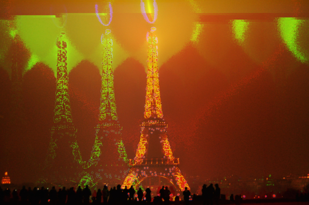
    Masuma Ahuja and Denise Lu for the Washington Post applied a technique called databending to a bunch of photos. The idea is that computer files — even though they represent different things like documents, images, and audio — encode data in one form or another. It’s just that sound files encode beats, notes, and rhythms, whereas image files encode hue, saturation, and brightness. So when you treat image files as if they were audio, you get some interesting results.

    See Jamie Boulton’s post from a couple of years ago for a detailed description on how to do this yourself with Audacity Effects.

  • Voter approval rates as butt plugs

    July 23, 2014

    Topic

    Data Art  /  butt plugs, government

    From a couple of years ago, but still relevant, I think. Matthew Epler took candidate approval ratings (again, this is from a little while ago), tossed them in a 3-D program, made the molds to match, and poured in some silicon. Boom. Butt plugs that represent data. It’s called Grand Old Party.

    Epler describes his project best:

    Grand Old Party demonstrates that as a people united, our opinion has real volume. When we approve of a candidate, they swell with power. When we deem them unworthy, they are diminished and left hanging in the wind. We guard the gate! It opens and closes at our will. How wide is up to us.

    So true.

  • Misery index based on perceived temperature →

    July 22, 2014

    Topic

    Maps  /  globe, weather, wind

    Late last year, Cameron Beccario made a wind map for earth, inspired by an earlier work by Fernanda Viegas and Martin Wattenberg. Beccario has been slowly adding overlays to the piece to show more dimensions of weather data around the world. The most recent overlay is what he calls a Misery Index, which is based on perceived air temperature.

    If you’ve seen the interactive globe already, it’s worth revisiting. Click on the earth label on the bottom left to see the new stuff.

  • You get a personal data site, and you get one, and you too →

    July 21, 2014

    Topic

    Self-surveillance  /  journal

    Personal data collection keeps getting easier and more efficient. Much of what was manual or clunky a few years ago is now automatic, done via the phone we carry every day anyway. More recently, personal data is finding a way out of the closed networks and applications and on to our own computers and servers.

    Anand Sharma’s personal site is the newest example of what an individual can do with his or her own data. On a whim a few months ago, Sharma downloaded the Moves app, which tracks your location, and was hooked. Then with some design inspiration from Tony Stark, Sharma put a site together to show a feed a several aspects of his life, mostly tracked with his phone.
    Read More

  • Flights around Ukraine →

    July 18, 2014

    Topic

    Maps  /  flights, New York Times

    The New York Times is covering Malaysia Airlines Flight 17 with a series of maps. The ones above show a sample of recent flights in the area. Some airlines, such as British Airways and Air France show a clear path around Ukraine, whereas others take a more direct route.

  • Geologic map of Mars

    July 18, 2014

    Topic

    Maps  /  Mars, USGS

    The USGS released a more detailed geologic map of Mars, not just renderings based on rough models.
    Read More

  • Spiky betting odds during LeBron James decision →

    July 17, 2014

    Topic

    Statistical Visualization  /  betting, LeBron James, sports

    LeBron James decided to head back to Cleveland, so naturally the odds that they win the championship went up. Todd Schneider charted the betting odds as the announcement happened to see how much they went up.

    Of course that 10% already had built in some likelihood that James would choose to play for the Cavaliers next season. Before Cleveland was considered a threat to land LeBron, their championship odds were around 2%, so the 10% Cleveland odds immediately before LeBron’s decision perhaps reflected market expectations that LeBron had a 50% chance of choosing Cleveland: 0.5 * 0.18 + 0.5 * 0.02 = 0.1

    Houston, who was expected to pick up Chris Bosh if James went to Cleveland, also saw a spike during the announcement, but the odds quickly came back down once Bosh decided to re-sign with Miami.

  • How much underwear to bring on a trip →

    July 16, 2014

    Topic

    Statistical Visualization  /  traveling, underwear

    Packing underwear for a short trip is easy. You just pack a pair for each day you’re away. However, longer trips require extra planning. Pack a pair for every day, and you get a bag that’s too heavy. Pack too few and you have to launder your dirties more often.

    Reed Kennedy and Carrie Smith gave this problem some extra thought, in search for the ideal underwear count, given the number of days you leave. The result is the chart above.

    Simply select your trip length on the top, and then move down to find your ideal underwear count. The numbers inside the grid cells indicate how many times you have to launder. Gold numbers indicate a perfect remainder of zero pairs of clean underwear by the time you get home.

    Note: This chart assumes you do not turn your underwear inside out for another wearing. Not that’d I’ve ever done that.

    See the full post for further dirty underwear details.

  • Visualization Education Mailbag

    July 15, 2014

    Topic

    Ask FlowingData  /  education

    It’s around that time of year when more people than usual ask for advice about degrees in statistics, career paths in visualization, and how to get started with something that looks awesome.

    The high of graduation from high school, undergrad, and grad school has settled, and it’s time to think about the future. Maybe summer brought more idle time at work to imagine what else you could do every day. I know the feeling.

    I’ll try to answer the more common questions. However, keep in mind that I’m nowhere near the best person to ask about these things. I didn’t grow interested in statistics until late in college, I studied remotely for most of my graduate student life, and although I consult occasionally, I run FlowingData for a living.

    So there’s your salt. Now some Q & A.

    Read More

  • Changing World Cup fans →

    July 13, 2014

    Topic

    Infographics  /  Kevin Quealy, New York Times, Shan Carter, Upshot

    Shan Carter and Kevin Quealy for the Upshot have a look at sports fandom once again using Facebook usage as a proxy. This time they examined shifting fan support during the World Cup.

    A new analysis by Facebook’s data science team analyzed migrations of fan support from one country to another throughout the tournament, stage by stage. It’s based partly on the contents of people’s posts, which means it is largely a reflection of the views of people who follow the World Cup at least to some degree. In the chart above showing global opinion, Brazil, the U.S. and Mexico have a strong influence on the results, because of their size, Facebook population and high interest in the World Cup.

    Keep in mind World Cup posts for a specific country aren’t counted once that team dropped from the tournament. So it’s not so much shifting fandom as it is who people rooted for during each round.

    Be sure to check out the whole article to see how fandom shifted by country. (Congrats, Germany.)

  • Mosquitos: The deadliest animal

    July 11, 2014

    Topic

    Infographics  /  Bill Gates, mosquitos

    This graphic from the Gates Foundation is from a few months ago, but it was just National Mosquito Control Awareness Week. The small illustrations in this case make the graphic. Although I’m interested in seeing those “wide error margins.”

  • FoamTree: Visualize hierarchical data with a lot of groups

    July 10, 2014

    Topic

    Statistical Visualization  /  treemap, voronoi

    For small-ish amounts of hierarchical data, most JavaScript libraries can handle the load. However, it gets tricky when you get into hundreds and thousands of levels and groups. FoamTree is a library that helps you with this problem.

    FoamTree

    It’s a Voronoi Treemap, which sure, looks kind of neat, but the nice part is how well it handles large amounts of groups. It’s puts off computation and rendering until it’s needed, so it cuts down on load and run times. Just check out the Tree of Life demo and select “Homo sapiens” in the ride sidebar to see how it works.

    The library is free to download, but you have to pay a license fee to get rid of the branding.

  • xkcd: Dominant players in chess and basketball →

    July 9, 2014

    Topic

    Statistical Visualization  /  chess, sports, xkcd

    I’m pretty sure xkcd is the only one who gets away with showing player ratings for both basketball and chess players in the same frame, without the y-axis labels. And somehow it seems logical.

  • Polling for stress →

    July 9, 2014

    Topic

    Statistics  /  NPR, polling, stress

    NPR, the Robert Wood Johnson Foundation and the Harvard School of Public Health conducted a survey about peoples’ stress levels and factors contributing to the stress. It took place for about a month. NPR started a summary of their findings, of what will be a two-week segment on the air and online.

    The above shows the percent of respondents in the age brackets who said the factors (the rows in this case) contributed to their current stress. It looks like I might be in a less stressful stage of my life, between the age of 30 and 39.

    It’s just an early summary of poll responses right now, so I’m hoping they go into more detail about statistically significant differences between demographics and how the 2,500-person sample correlates to the the US population.

  • Birth year and political leanings →

    July 8, 2014

    Topic

    Statistical Visualization  /  Amanda Cox, New York Times, Upshot

    A statistical model, from Yair Ghitza of Catalist and Andrew Gelman of Columbia University, estimates when people form their political preferences. The analysis uses presidential approval ratings from Gallup to approximate political events “that estimates when people form their political preferences.”

    Amanda Cox for the Upshot demonstrates the model in an interactive. Simply drag the slider to see how the political leanings of you and your birth cohort changed over time. The takeaway: Events between the ages of 18 to 24 are far more influential than those that occur at an older age.

    It seems like the model might apply to a lot of things in life.

  • Whaling in Japan explained →

    July 8, 2014

    Topic

    Infographics  /  Adolfo Arranz, South China Morning Post, whaling

    After a ruling by the United Nations International Court of Justice, Japan was ordered to stop whaling in parts of Antarctica. However, Japan’s Prime Minister Shinzo Abe recently sees the whaling practice differently. Adolfo Arranz for the South China Morning Post explains in a detailed graphic. Above is only about a third of it, so be sure to click through for the full version.

  • Data Underload  /  kidding, listicle

    19 Maps That Will Blow Your Mind and Change the Way You See the World. Top All-time. You Won’t Believe Your Eyes. Watch.

    Many lists of maps promise to change the way you see the world, but this one actually does.

    Read More
  • Test your geographic knowledge in Google map game

    July 7, 2014

    Topic

    Maps  /  game, Google

    Smarty Pins is a simple, fun map game by Google. You get a trivia clue about some location, and the goal is to drop the pin as close as you can to the correct place. You start with 1,000 miles, and you get docked each time for how far your choice was from the actual location.

    For more on how little you know about where stuff is, see also the state matching game and the Mercator map puzzle.

  • Data trails explainer

    July 3, 2014

    Topic

    Infographics  /  animation, Erica Gorochow, Jer Thorp

    We produce data all the time, everywhere we go, and this process implies something about how we live. Jer Thorp explains in this short explainer video animated by Erica Gorochow.

  • Filing cabinet follows people around, like a data trail

    July 3, 2014

    Topic

    Data Art  /  privacy, tracking

    Jaap de Maat, a graduate student at the Royal College of Art, rigged a filing cabinet to follow people around for his final project. It reminds people of the data traces we leave behind. It’s called I know what you did last summer.

    It is physically impossible for the human brain to remember every event from our past in full detail. The default setting is to forget and our memories are constructed based on our current values. In the digital age it has become easier to look back with great accuracy. But this development contains hidden dangers, as those stored recollections can easily be misinterpreted and manipulated. That sobering thought should rule our online behaviour, because the traces we leave behind now will follow us around for ever.

    See more details on Wired.

  • Page 217 of 392
  • <
  • 1
  • ...
  • 214
  • 215
  • 216
  • 217
  • 218
  • 219
  • ...
  • 392
  • >

Analyze, visualize, and communicate data usefully, beyond the defaults.

Become a member →

Recently for Members

May 8, 2025
When the data is not what it seems

May 1, 2025
Finding the Right Charts

April 24, 2025
Visualization Tools, Datasets, and Resources – April 2025 Roundup

April 17, 2025
Breaking Out of Chart Software Defaults

April 15, 2025
Line Chart with Decorative Neon Accents

Browse by Chart Type See All →

Pyramid Chart Treemap Spiral Chart Dot Plot Strip Plot Density Plot Timeline Surface Plot Parallel Sets Ternary Plot

Browse By Topic

  • Visualization

    Seeing data

  • Maps

    Seeing geographic data

  • Infographics

    Explaining data

  • Networks

    Connecting data

  • Statistics

    Analyzing data

  • Software

    Working with data

  • Sources

    Getting data

  • Design

    Making data readable

Get the Book

Visualize This: The FlowingData Guide to Design, Visualization, and Statistics

Available now.

Order: Amazon / Bookshop

Made by FlowingData

  • The Process

  • Data Underload

  • Chart Everything

  • Guides

  • Books

  • Shop

  • About
  • Contact
  • Newsletter
  • LinkedIn
  • Instagram
  • Bluesky
  • RSS
Copyright © 2007-Present FlowingData. All rights reserved.