Last month, This American Life ran a story about research that asked if you could change people’s mind about issues like same-sex marriage and abortion — with just a 22-minute conversation. The research was published in Science, but Donald Green asked the publication to retract the paper recently. It seems his co-author and UCLA graduate student, Michael LaCour, made up a lot of data.
Read More
-
-
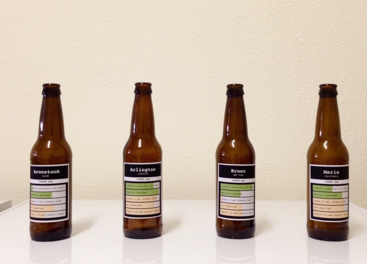
I was toying around with the idea of multivariate beer, where the ingredients varied by county demographics. Could I taste the difference? Here’s how the experiment went.
-
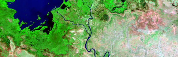
Since the 1970s, NASA has used satellites to take pictures of the Earth’s surface. This is an ongoing process, so when you string together the photos and play them out like a flip book, you see dramatic changes where cities boom, bodies of water dry up, and forests disappear. This is the motivation behind Earthshots, available for viewing via USGS.
Read More -
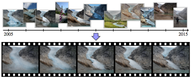
Think of time-lapse photography, and you imagine someone sets up a camera in a single spot to take photos at set periods of time. Researchers from the University of Washington and Google tried something else.
See it in action -
Force of Nature by FIELD is a running installation commissioned by Nike. It uses data fed from Kinect and sensors hooked up to a treadmill to create an experience as if you were running through a sea of particles.
Watch the video -
With wearables and cheaper and advancing tech, the how part of personal data collection is fairly straightforward. So now we move into the more socially complex questions around privacy, money, and usage. Ariana Eunjung Cha for the Washington Post looks a bit closer at the quantified self.
Read More -
-
Here’s a straightforward animation that shows US county boundaries change between 1629 and 2000. You can also grab all the data from the Newberry Library site.
Watch video -
A while back, Nate Silver and Allison McCann for FiveThirtyEight estimated age based on a person’s name using a relatively straightforward calculation. Using data from the Social Security Administration, they looked at number of people given a name in a year and crossed that with actuarial tables for annual deaths.
Randal Olson turned that into an interactive name age calculator. Punch in a name. See the median age distribution.
Read More -
As in, you data me, I data you, and they data us. Jer Thorp argues for a verbified data, because after all, it’s already in a grammatical shift with the whole big data thing. Just take it a step further already.
Read More -
Fathom provides an interactive browser for a year of earthquakes, based on data from USGS. You’ve likely seen this data before, but the interaction is quite useful and applicable to other maps.
Filters on the right let you turn layers — population density, mortality risk, and the tectonic plates lines — on and off and subset by magnitude. The timeline on the bottom lets you scrub by time with an adjustable time span.
-
There’s been a sudden bump in grid maps lately taking the place of state choropleths. For example, Haeyoun Park used them to show changes in state laws for gay marriage. The advantage over the choropleth is that each state gets equal visual space, and the placement still lets people find specific states and interpret geographic relationships.
The grid format is pretty much universally liked, but now we must ask what shape is best? NPR tried the grid with hexagons. Danny DeBelius explains the reasoning, and the grid map landscape may never be the same again.
But you know what? Forget all that.
Read More -
When you walk down the aisles of the grocery store, there are probably shelves of organic foods with branding that looks small, local, and healthy. It’s almost like you’re buying products direct from the farmer. But probably not. The Washington Post highlights the ownership, based on work by Phil Howard, who has looked at similar ownership networks with beer, wine, and soda in years past.
Read More -
Wyoming just passed a law that makes it illegal to collect data about the environment, if you intend to send it to a federal or state government agency.
The reason? The state wants to conceal the fact that many of its streams are contaminated by E. coli bacteria, strains of which can cause serious health problems, even death. A small organization called Western Watersheds Project (which I represent pro bono in an unrelated lawsuit) has found the bacteria in a number of streams crossing federal land in concentrations that violate water quality standards under the federal Clean Water Act. Rather than engaging in an honest public debate about the cause or extent of the problem, Wyoming prefers to pretend the problem doesn’t exist. And under the new law, the state threatens anyone who would challenge that belief by producing information to the contrary with a term in jail.
Um, wut?
The intent part confuses me most. So is it okay to collect environmental data that you don’t plan on sending to a government agency? If I were in Wyoming, I’d grab the nearest water kit, collect data water data like a fiend, and send it to my local paper, news outlet, or anywhere else that could publicize high concentrations of E. coli.
-
There were some blips on Twitter last week for the DrunkTufte hashtag for which people made some not so readable charts. I’m really hoping it becomes a thing. The entry below is by Matt Fogel. Makes sense to me.
-
Virginia Eubanks for Slate describes the dangers of relying too heavily on black-boxed algorithms to create and enforce policies.
Policy algorithms promise increased efficiency, consistent application of rules, timelier decisions, and improved communication. But they also raise issues of equity and fairness, challenge existing due process rules, and can threaten Americans’ well-being. Predictive policing relies on data built upon a foundation of historical racial inequities in law enforcement. Remote eligibility systems run on the questionable assumption that lacking a single document—in a process that often requires dozens of pages of supporting material—is an affirmative refusal to cooperate with the welfare determination process.
-
For a while, somewhere in between 2007 and 2011, infographics — in the everyday person’s sense, not the statistician’s — were all the rage. They came in lots of shapes and sizes and covered a wide span of useful to useless topics. While these sort of graphics are still around, they’re dwarfed by a different brand of work these days. A more mature one.
Mark Wilson for FastCompany describes the evolution. (Disregard the “What Killed The Infographic?” title of the article. Spammy embedded infographics are slowly dying, but the good stuff is a young whippersnapper discovering its powers.)
Read More -
Eric Benson for FiveThirtyEight delves into cattle theft, which can cost an owner millions of dollars overnight, and the link to rising beef prices.
Most cuts of beef increased in cost since 1995, but brisket, while still not the most expensive cut, has really increased in value in the past couple of years. It peaked in January 2015 at $3.52 per pound wholesale. It was only $2.26 in January 2014. That’s kind of big deal considering you’re buying a 10-pound piece of meat at the grocery store, versus a couple of pounds of steak.
-
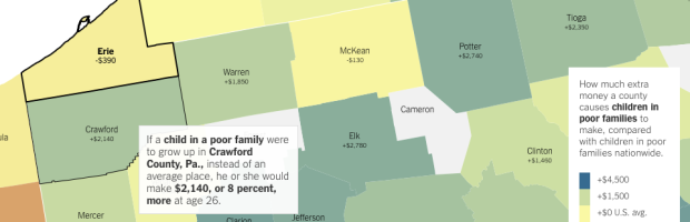
An analysis by Raj Chetty of Harvard University and Nathaniel Hendren of NBER estimates increased income and education for poverty-level households, based on where one lives. The results are based on tax data — 1040 and W-2 forms — from the IRS, and the focus of the analysis is on those who moved from one county to another.
The main finding was that location matters. The Upshot mapped the results, with an article whose text changes based on the county you select.
Read More
Recently for Members
Second Edition
 Visualize This: The FlowingData Guide to Design, Visualization, and Statistics (2nd Edition)
 Visualize This: The FlowingData Guide to Design, Visualization, and Statistics (2nd Edition)
New tools, refined process.
Browse by Chart Type See All →


