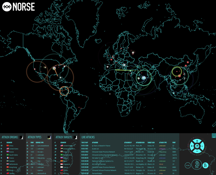
Norse monitors cyber attacks in real-time. This is their map of what’s going on. (All I hear is pew, pew, pew when I watch it.) [via Boing Boing]
Norse monitors cyber attacks in real-time. This is their map of what’s going on. (All I hear is pew, pew, pew when I watch it.) [via Boing Boing]
I’m doing a Reddit AMA tomorrow hosted by the DataIsBeautiful subreddit. It’ll be at 1:30pm EST on August 27, 2015.
In case you’re unfamiliar with the AMA (ask me anything), it’s just a fun Q&A thing, where you ask me questions on Reddit, and I pause to think of something good to say. I might type some answers.
Ask me about visualization, data, blogging, graduate school, my hate of commuting, my kid’s poop habits, beer, or whatever else. I’m game.
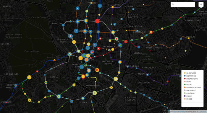
This map of subway complaints in Madrid isn’t geographically relevant to me, but the encoding scheme is interesting.
Each spot represents a station, and a collection of concentric circles represent the various types of complaints for that station. Larger circles represent more complaints, and more circles represent more complaint types.
So for someone in charged of repairs, maintenance, and overall system performance could pretty quickly figure out the problem areas and what actions to take.
The New York Times got me to watch an interview with Justin Bieber in it multiple times. Along with (mostly) Diplo and Skrillex, a visual layer set on top of the video interview further explains what the musicians are talking about.
Here, just watch it.
Read More
Jim Davies for Nautilus on our unconscious bias and how being non-biased leads to more bias:
And the more we convince ourselves that we don’t have certain biases, the more likely we are to exhibit them. If we believe we’re good people, for example, we may stop trying to be better and may be more likely to act indecently. Similarly, if we think we’re smart, we might skip studying for a test and give ignorant answers. In general, if we believe we’re unbiased, we’re giving ourselves permission to be biased.
I don’t know. Seems biased.
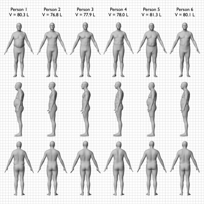
Body mass index is often used as a way to set weight classes of underweight to obese, but the measurement is likely too basic. From the New York Times:
The illustrations here were created from scans of six people, who were all 5 feet 9 inches tall and 172 pounds. This means that though their bodies look very different, they all have exactly the same body mass index, or B.M.I. At 25.4, technically each of them could be considered overweight.
And Dwayne “The Rock” Johnson is classified as obese.
Of course, this applies to most indexes and classifications. You try to get it to work for as many as people, places, or things as you can, but there’s always going to be exceptions and more information to be had.
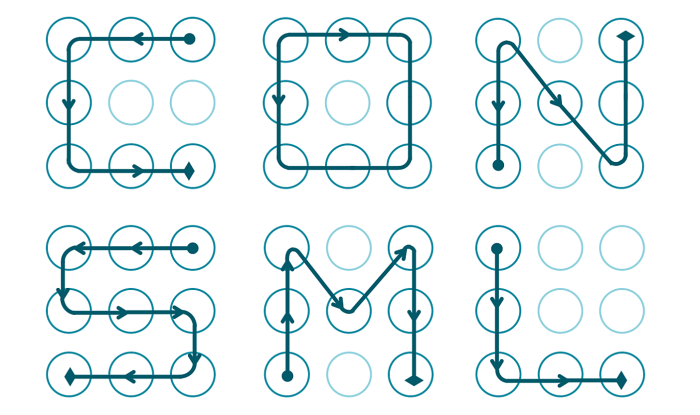
Passwords are annoying, which is why so many people use passwords that are less than secure. Maybe the keys are a bit shorter than they should be, match a word in the dictionary, or are repeats across services. In these cluster of passwords, patterns become obvious.
Marte Løge, for her master’s thesis at Norwegian University of Science and Technology, wondered if similar rules applied to Android lock screen patterns. Dan Goodin for Ars Technica explains:
Data breaches over the years have repeatedly shown some of the most common passwords are “1234567”, “password”, and “letmein”. Løge said many ALPs suffer a similar form of weakness. More than 10 percent of the ones she collected were fashioned after an alphabetic letter, which often corresponded to the first initial of the subject or of a spouse, child, or other person close to the subject. The discovery is significant, because it means attackers may have a one-in-ten chance of guessing an ALP with no more than about 100 guesses. The number of guesses could be reduced further if the attacker knows the names of the target or of people close to the target.
So wait a minute. What’s a lock screen?
I have no idea what’s going on here, and I prefer to keep it that way.
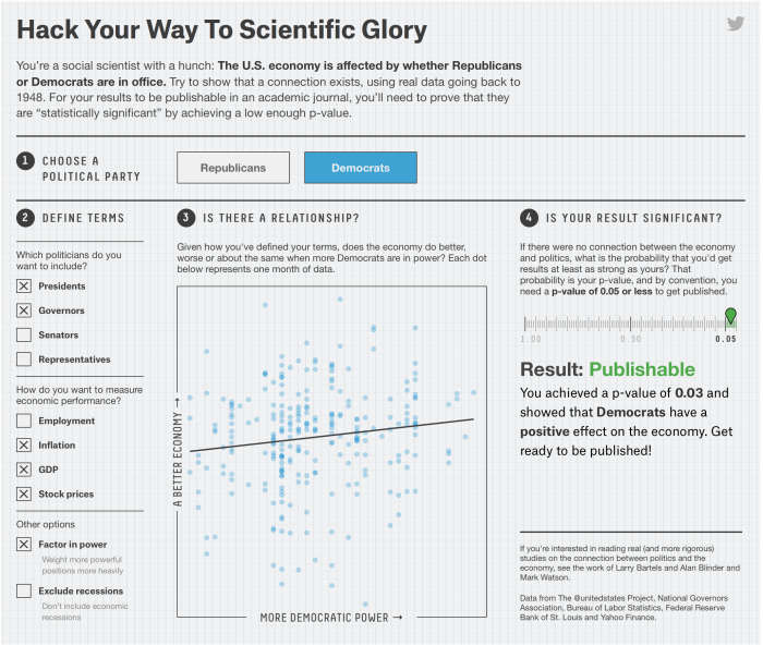
Science is hard. Statistics is hard. Proving cause and effect is hard. Christie Aschwanden for FiveThirtyEight, with graphics by Ritchie King, discusses the uncertainty in data and the challenge of answering seemingly straightforward questions via the scientific method.
Leading the article is a description of p-hacking. Mess around with variables enough, and you too can get a p-value low enough to publish results in a distinguished journal.
A fine interactive lets you try this yourself, showing that the political party in office affects the economy. The funny part is that you can easily “prove” that both parties are good for the economy.
Which political party is best for the economy seems like a pretty straightforward question. But as you saw, it’s much easier to get a result than it is to get an answer. The variables in the data sets you used to test your hypothesis had 1,800 possible combinations. Of these, 1,078 yielded a publishable p-value, but that doesn’t mean they showed that which party was in office had a strong effect on the economy. Most of them didn’t.
The p-value reveals almost nothing about the strength of the evidence, yet a p-value of 0.05 has become the ticket to get into many journals. “The dominant method used [to evaluate evidence] is the p-value,” said Michael Evans, a statistician at the University of Toronto, “and the p-value is well known not to work very well.”
I guess that means we have to think more like a statistician and less like a brainless, hypothesis-testing robot.
Artist Neil Harbisson is completely colorblind, so he sees in black and white. But he still perceives color. Harbisson has an implant in the back of his head that’s essentially an antenna with a color sensor attached. The sensor signals are transposed to audio and he listens through bone conduction.
Watch the video
Schiphol Airport in Amsterdam put a camera on a piece of checked luggage and recorded the winding path of conveyer belts and luggage lifts. It’s like a scene straight out of a cartoon.
Be sure to check out the 360 version too. It’s the same route as above but you can click and drag to see all around as the luggage moves through. [via Laughing Squid]
There have been over 2,000 nuclear detonations since 1945. Orbital Mechanics mapped each documented test in animated form. It’s mostly about mood and the individual explosions. More journal-like, although not much annotation unfortunately.
Red represents atmospheric explosions, yellow represents underground, and blue represents underwater.
See also artist Isao Hashimoto’s rendition from a few years ago. It’s the same data with an entirely different feel.
[via kottke]
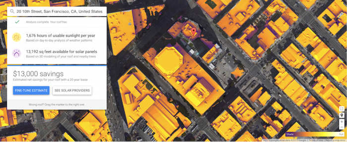
If you own a home or have gone to a home improvement store recently (in California at least), you’ve probably heard the solar panel pitch by now. They always start by asking about your electric bill and then provide rough estimates for what you might save if you got solar panels. For a more accurate estimate, you schedule a consultation. Project Sunroof from Google aims to provide a more objective summary.
Currently providing information for the San Francisco Bay Area, Fresno, and Greater Boston, the project lets you punch in an address to see both potential energy and potential savings if you were to lease solar panels, pay for them in installments, or to buy outright.
The project calculates estimates based on 3-d models of rooftops, shade from nearby trees and structures, sun positions over a year, and historical cloud and temperature patterns.
The Sustainable Design Lab at MIT and MoDe Studio did something similar to this a few years ago for the Cambridge, Massachusetts area. I’m guessing their project served as inspiration for Sunroof. Hopefully Google can expand to more areas. [via Ars Technica]
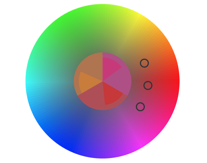
Color in visualization can be a finicky process. You want colors to correspond with the topic at hand, you must make sure that readers can actually see the palette you choose, and people must decode appropriate differences between shades.
So here’s a game to help hone your skills.
The straightforward game by Method of Action shows you a color palette, and the goal is simply to match. Each stage gets a bit more difficult and surprisingly more challenging.
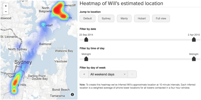
How much can you find out from “just the metadata” about your cell phone? ABC News in Australia aims to find out.
Australia’s new data retention laws mean phone and internet companies have to save this information for two years: that’s every time you call someone, where you call them from, which cell tower your phone pings every time it connects to the internet, and more.
On a mission to find out what that data might reveal, ABC reporter Will Ockenden took a ‘surveillance selfie’: he got access to his own metadata, and now for the first time you can see what an individual Australian’s metadata actually looks like.
They’ve started with a few summary interactives that show where Ockenden goes during the week through cell tower connections and who he communicates with through call logs. They’ll be going deeper in the coming weeks. Also, Ockenden’s data is available to download so that you can look for information too.
The Paul Revere example came to mind. Just metadata?
 Visualize This: The FlowingData Guide to Design, Visualization, and Statistics (2nd Edition)
New tools, refined process.


