Scatter Plot
Dots are placed in an x-y coordinate system, based on two variables. The plot is often used when it is thought that the variables are correlated.
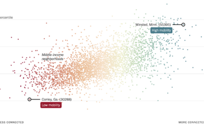
More friendships between rich and poor might mean less poverty
Recently published in Nature, research by Chetty, R., Jackson, M.O., Kuchler, T. et…
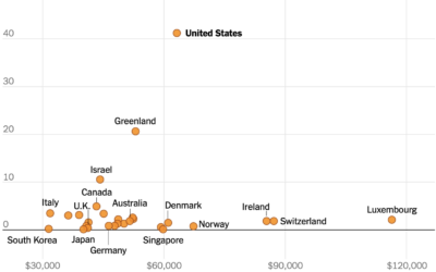
U.S. still the outlier for gun homicide rate
This chart from The New York Times, based on estimates from Our World…
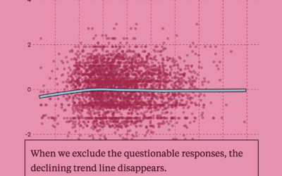
A test for a potentially flawed study on randomness and age
In 2017, a study posited that human behavior complexity peaks at age 25…

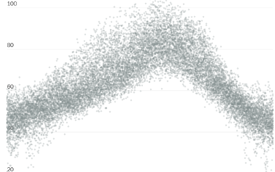
Possible cheating seen in a scatterplot
When plotting Russian election results, a structured grid patterns appear. From The Economist:…
Historical context for the heat in the Pacific Northwest
It’s been hot in the Pacific Northwest the past few days. NYT’s The…
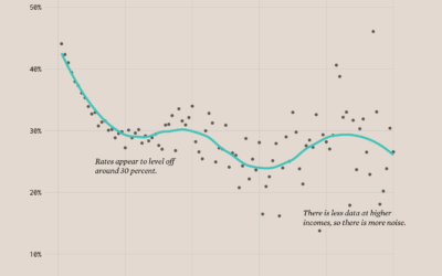
Divorce Rates and Income
Divorce rates are tied to job security, age, and occupation, so it should make sense that we see a pattern when we plot divorce rates against income.
Population Growth and Seats Gained
The Census Bureau released state population counts for 2020. Here's how each state gained and lost population and seats.
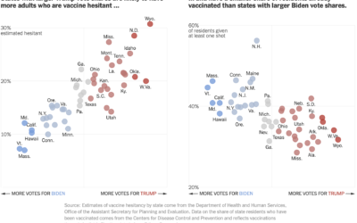
Voting and vaccination rate
Danielle Ivory, Lauren Leatherby and Robert Gebeloff for The New York looked at…
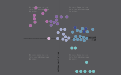
Minimum Wage and Cost of Living
We already looked at minimum wage over time, but when it comes to geography and income, you also have to consider the cost of living for a fair comparison.
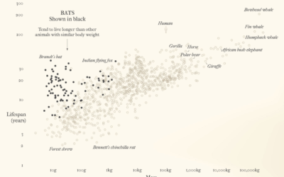
Bats and outbreaks
For Reuters, Julia Janicki and Simon Scarr, with illustrations by Catherine Tai, show…
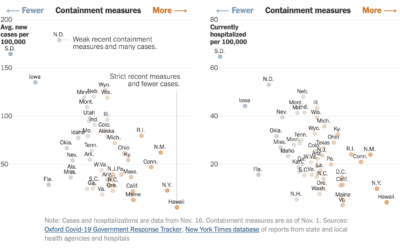
State restrictions and hospitalizations
The University of Oxford’s Blavatnik School of Government defined an index to track…
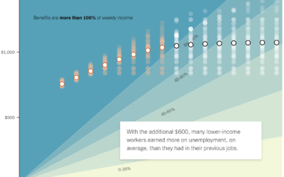
If the unemployed lose $600 per week
A $600 per week benefit expires for the unemployed at the end of…
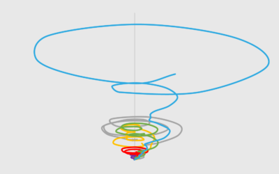
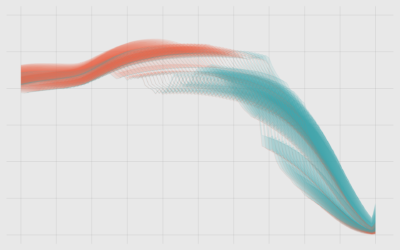
Tornado Lines – Useful or Not? (The Process 088)
It looks like a tornado. It's messy. It's circular. It almost looks intentionally confusing. But how bad is it really?
Saving for Retirement and Age
People tend to have more money saved up over time, but range and variation also grow, and often it’s not enough.
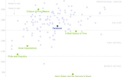
Readability of privacy policies for big tech companies
For The New York Times, Kevin Litman-Navarro plotted the length and readability of…
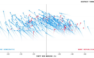
Higher turnout for midterm elections
Bloomberg charted voter turnout for the just past midterm elections, comparing 2018 against…
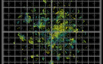
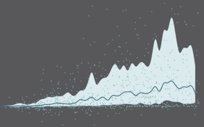
Millions of data points with deep scatterplots
Ben Schmidt uses deep scatterplots to visualize millions of data points. It’s a…
Ask the Question, Visualize the Answer
Let's work through a practical example to see how asking and answering questions helps guide you towards more focused data graphics.