Visualization
Showing the stories in data through statistics, design, aesthetics, and code.
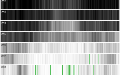
Getting to zero coal in Britain
For The Guardian, Niko Kommenda shows the decrease in coal usage for power…
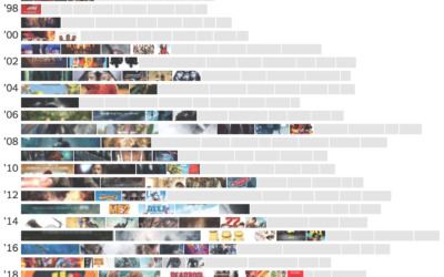
Rise of the summer sequel
For The New York Times, Keith Collins shows the growing popularity of summer…
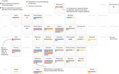
New abortion restrictions by state, since 2011
For FiveThirtyEight, Amelia Thomson-DeVeaux and Gus Wezerek categorized and mapped new abortion restrictions…
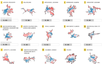
Mapping politically polarized cities
Rachael Dottle, for FiveThirtyEight, looked for political differences in cities and ranked them,…
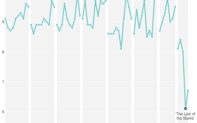
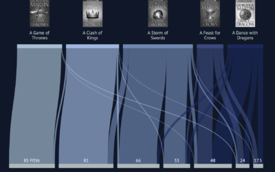
Game of Thrones viewer ratings by season
The last episode is coming. Some people don’t like how it’s ending, and…

More candidates and earlier
For Bloomberg, Lauren Leatherby and Paul Murray describe the heightened eagerness to enter…
Interactive explainer for how disease and ideas spread through a network
Kevin Simler uses interactive simulations to explain how things — ideas, disease, memes…

Sprawlball, an in-depth look into the evolution of modern basketball
If you’ve seen a basketball shot chart in the past few years, it…
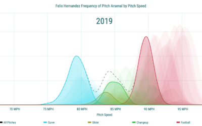
Pitch speed distribution, a decrease with age
Pitch speed starts to decrease with a baseball player’s age at some point.…
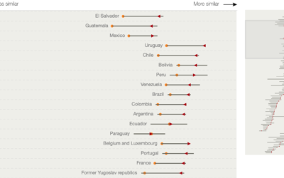
Growing similarity in global diet
Diet around the world is growing more similar. National Geographic charted estimates of…

Amount of fish to raise a big fish
Raising living things requires resources. In the case of fish, it requires more…
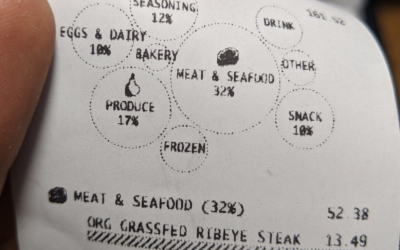
Remixing the grocery receipt with data visualization
In prototyping mode, Susie Lu incorporated visualization into the common receipt from the…
Game of Thrones books versus television series
I think I started watching Game of Thrones around the fourth season (my…
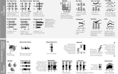
Chart chooser based on data format
There are many chart types to choose from, which is great, because there’s…
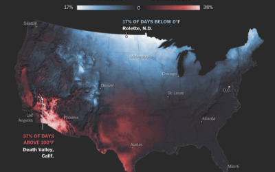
Maps of natural disasters and extreme weather
For The Washington Post, Tim Meko mapped floods, tornados, hurricanes, extreme temperatures, wildfires,…
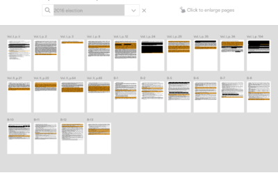
A more detailed view of the Mueller Report
By now we’ve all seen the zoomed out thumbnail view of the Mueller…
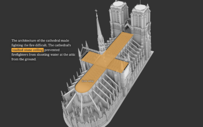
What happened at Notre-Dame
Notre-Dame in Paris, France was on fire. The New York Times describes what…