Visualization
Showing the stories in data through statistics, design, aesthetics, and code.
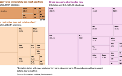
Number of abortions in each state, by restriction status
The Washington Post has a set of charts showing the current status of…
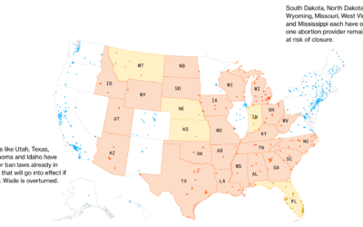
Map of clinics at risk of closure
If Roe v. Wade is overturned, over 200 clinics would potentially have to…
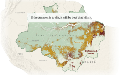
Beef and the rainforest
People like beef. To raise more cattle, companies need more land. Sometimes to…
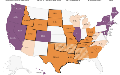
State policy if Roe v. Wade were overturned
If Roe v. Wade were overturned, abortion policies would change in many states.…


Tucker Carlson word usage and patterns
Tucker Carlson hosts a nightly show viewed by millions. The New York Times…
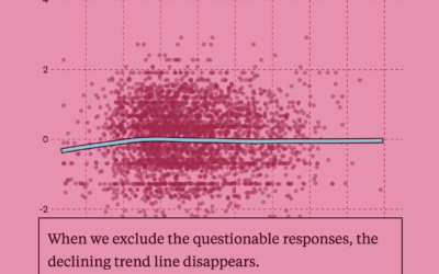
A test for a potentially flawed study on randomness and age
In 2017, a study posited that human behavior complexity peaks at age 25…
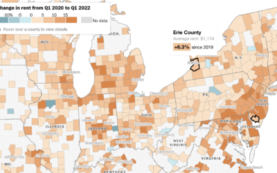
How much rent increased where you live
Rent increased pretty much everywhere in the United States over the past year.…
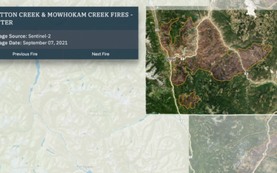
Wildfires and floods, a geographic before and after
In 2021, a large portion of North America was stuck in a heat…
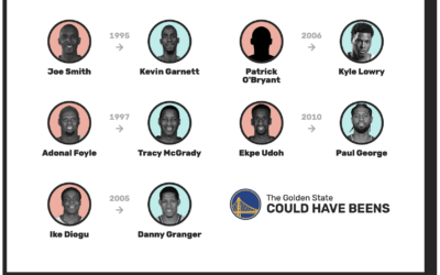
Redrafting the NBA, based on past player performance
With the NBA playoffs underway, it can be fun to watch the best…

Tonga shockwave around the world
Earlier this year, an underwater volcano erupted in the island nation of Tonga.…
Comparing rich people incomes and the taxes they pay
Based on leaked IRS data for the 400 wealthiest Americans, ProPublica provides a…
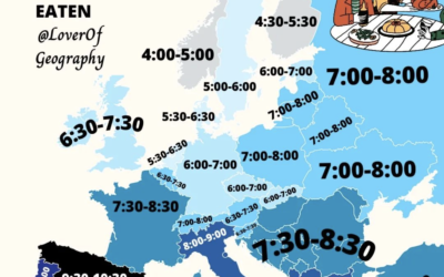
When people eat dinner in Europe
This map by @loverofgeography shows the usual dinner times for countries in Europe.…
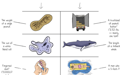
Jeff Bezos wealth to scale
Jeff Bezos’ wealth is difficult to understand conceptually, because the scale is just…
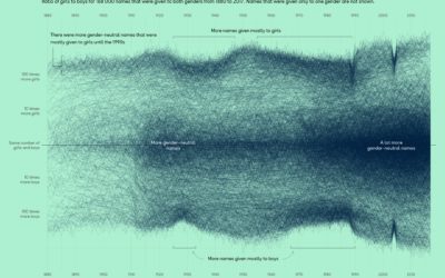
More gender-neutral names
Georgios Karamanis plotted the ratio of girls-to-boys over time for all the names…
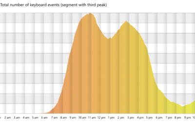
Working the triple peak
Microsoft researchers analyzed keystrokes by time of day, for a sample of Microsoft…