Visualization
Showing the stories in data through statistics, design, aesthetics, and code.

Chartball is sports data visualized in a playful way
With Chartball, Andrew Garcia Phillips has visualized sports data for a while, publishing…
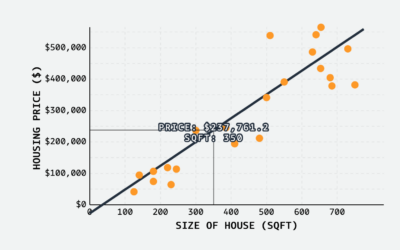
Linear regression visual explainer
MLU-Explain continues with their visual explainers for machine learning and statistical concepts. Most…
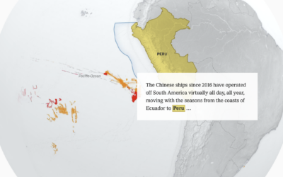
China’s fishing patterns shift globally
China’s fish supply is running low along its own coast, so they’ve shifted…
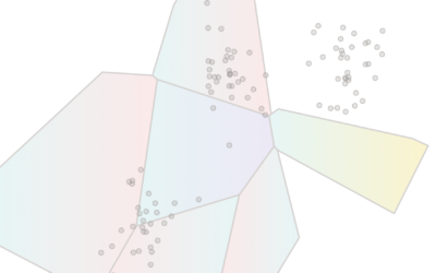
K-Means clustering visually explained
Say you want to identify clusters in a scatterplot of points. K-Means is…

Coffee versus tea in charts
Anahad O’Connor, Aaron Steckelberg and Garland Potts, for The Washington Post, made charts…
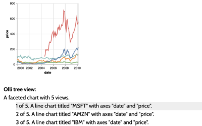
Accessible visualization with Olli JavaScript library
The Olli library aims to make it easier for developers to improve the…

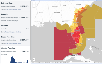
Mapping climate-related hazards in real-time
Bringing in data from various federal agencies:
Climate Mapping for Resilience and Adaptation…
Days-since tickers for all the natural disasters
You know those signs in workplaces that keep track of days since injury?…
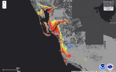
Potential storm surge flooding map
NOAA provides a map of potential flooding due to Hurricane Ian headed towards…
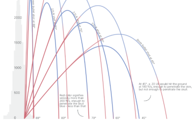
Trajectories of celebratory gunfire
When someone fires a gun into the air, the bullet travels thousands of…
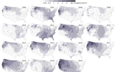
Maps of wildfire smoke pollution
Wildfire obviously damages the areas it comes in direct contact with, but wildfire…

Climate and the San Francisco fog
A reliable dense fog in San Francisco is a defining characteristic of the…

Sonic landscape of Mexico City
Aaron Reiss and Oscar Molina Palestina, for The Pudding, explore the sounds of…
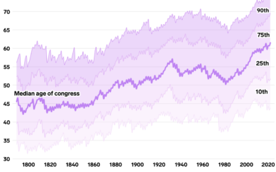
Oldest U.S. government
Annie Fu, Walt Hickey, and Shayanne Gal, for Insider, show the disproportionately aging…
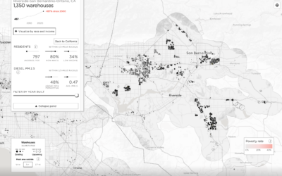
Map of mega warehouses in the United States
With the growth in online shopping over the years, companies required more space…