Visualization
Showing the stories in data through statistics, design, aesthetics, and code.
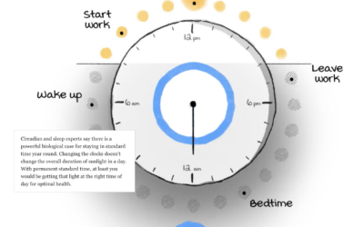
Daylight saving time and circadian rhythms
Daylight saving time ends in the United States this weekend and ended already…
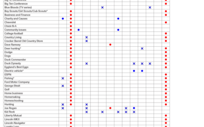
How you might vote based on what you like
By Angie Waller, this table shows how Facebook thinks you’ll vote based on…
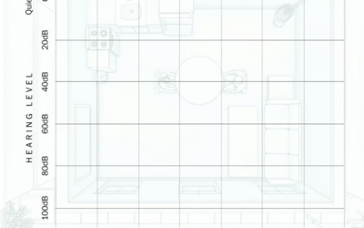
What hearing loss sounds (and looks) like
Using an audiogram as a backdrop, Amanda Morris and Aaron Steckelberg, for The…
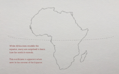
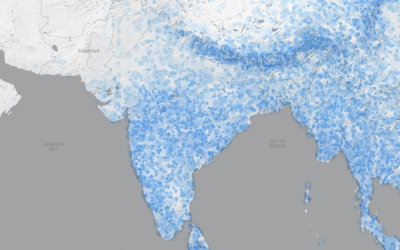
Geographic misconceptions about the location of continents
When you’re used to looking at the world through a certain lens, such…
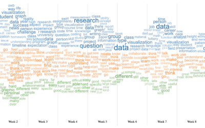
Word cloud + Streamgraph = WordStream
I hear it all the time from chart purists. “I love the streamgraph!”…
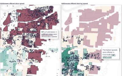
Slow internet for the same price as fast internet
When you pay for internet, it seems like a reasonable expectation that if…
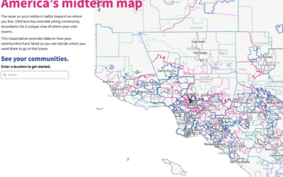
All the elections where you live
We tend to talk about elections as this uniform thing. People vote for…

Chartball is sports data visualized in a playful way
With Chartball, Andrew Garcia Phillips has visualized sports data for a while, publishing…
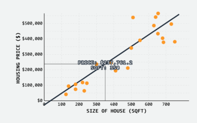
Linear regression visual explainer
MLU-Explain continues with their visual explainers for machine learning and statistical concepts. Most…
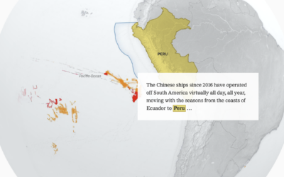
China’s fishing patterns shift globally
China’s fish supply is running low along its own coast, so they’ve shifted…
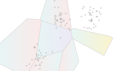
K-Means clustering visually explained
Say you want to identify clusters in a scatterplot of points. K-Means is…

Coffee versus tea in charts
Anahad O’Connor, Aaron Steckelberg and Garland Potts, for The Washington Post, made charts…
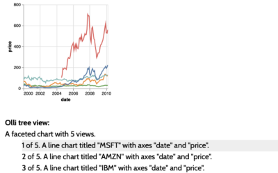
Accessible visualization with Olli JavaScript library
The Olli library aims to make it easier for developers to improve the…