Visualization
Showing the stories in data through statistics, design, aesthetics, and code.
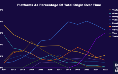
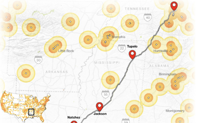
Where memes from the past decade came from
Know Your Meme analyzed a decade of meme data to see where the…
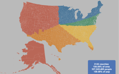
Splitting the US population evenly, with arbitrary shapes
By Engaging Data, this interactive map shows various splits of the United States…
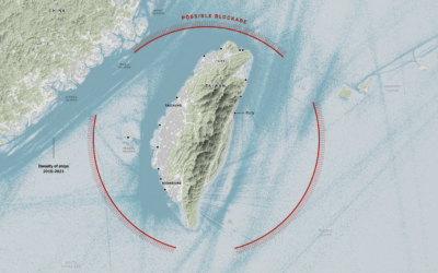
China’s possible blockade around Taiwan
It appears China wants to impose a blockade around Taiwan with ships, submarines,…
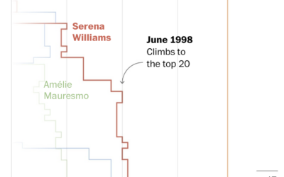
Losses and comebacks of Serena Williams
We tend to celebrate the wins in sports and often forget about or…

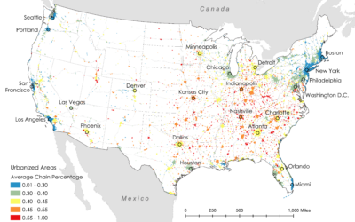
Where restaurant chains dominate
Researchers Xiaofan Liang and Clio Andris estimated the percentage of restaurants that are…

Meteorologist delighted by surprise map interaction
Meteorologist Greg Dutra was delivering the daily weather news for ABC Chicago and…
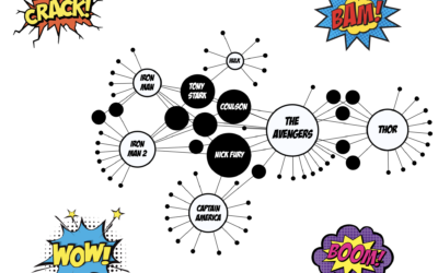
Network for Marvel Cinematic Universe
With a fun view of the Marvel Cinematic Universe, Tristan Guillevin walks through…

Megaflood scenario
Highlighting research by Xingying Huang and Daniel L. Swain, who studied “plausible worst…
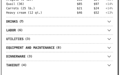
Breaking down the higher price on a restaurant receipt
If you’ve eaten at a restaurant lately, you might have noticed a substantially…
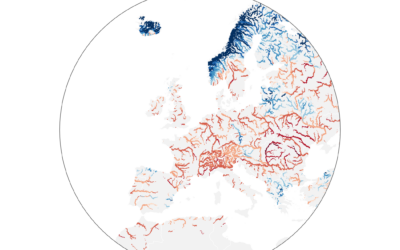
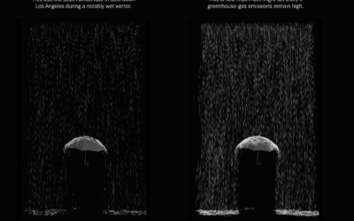
Worst drought in Europe, in 500 years
Dominic Royé mapped river discharge in Europe over the past few months:
A…
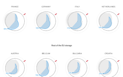
How much gas European sites have stored for the winter
Reuters goes with the radar chart to show gas supplies, as European countries…

Tracked while reading about being tracked at work
While reading this NYT article, by Jodi Kantor and Arya Sundaram, on the…
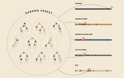
Visual explanations for machine learning
As part of a teaching initiative by Amazon, MLU-Explain is a series of…
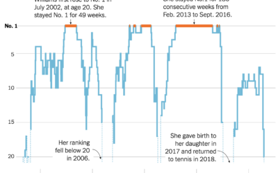
Serena Williams’ career rankings
Serena Williams announced her retirement from professional tennis. As is required for any…
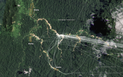
Finding illegal airstrips in Brazil
Using a combination of satellite imagery, crowdsourced databases, and analyses, The New York…