Visualization
Showing the stories in data through statistics, design, aesthetics, and code.
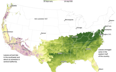
When spring is coming where you live
Going off the calendar, today is the first day of spring, but nature…
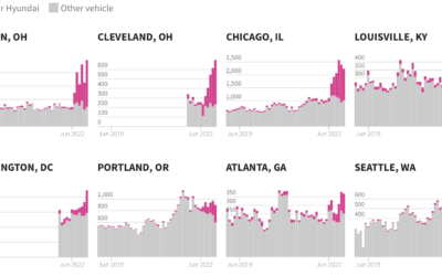
Excess Kia and Hyundai car thefts
In the middle of 2022, a popular video on TikTok, since taken down,…
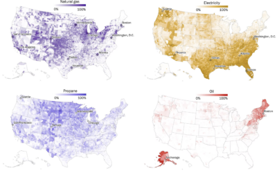
Maps of home heating sources in the United States
For The Washington Post, John Muyskens, Shannon Osaka, and Naema Ahmed mapped the…

Finding the physical location in an online video via Google Maps clues
GeoGuessr player rainbolt is next-level good at reading Google Maps. Given a short…

Hypothetical map that shows how access changes if more states ban abortion
Based on analysis by economics professor Caitlin Myers, FiveThirtyEight provides a hypothetical map…
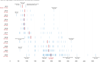
Increasing range of electric vehicles
Hannah Ritchie compared electric vehicle range over the years:
The median range of…
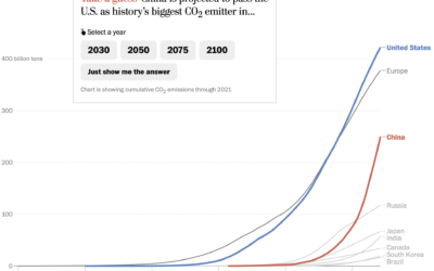
Line chart race to show emissions
For The Washington Post, Harry Stevens used the line chart equivalent of a…

Asian representation at the Oscars
Asian characters in American films are historically less integral to the stories and…

Why South Koreans grew taller so quickly
As a world population, we’re growing taller, but South Koreans seemed to grow…

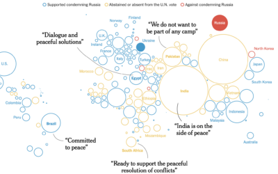
Shooting down the Chinese balloon
Shooting down a floating balloon out on its lonesome seems like a straightforward…
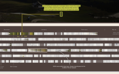
Ski resorts dealing with fewer snow days
For Bloomberg Green, Jin Wu, Laura Millan and Hayley Warren, on the challenges…
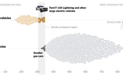
Emissions from big electric trucks vs. gas vehicles
Based on estimates from CarbonCounter by the MIT Trancik Lab, electric vehicles typically…
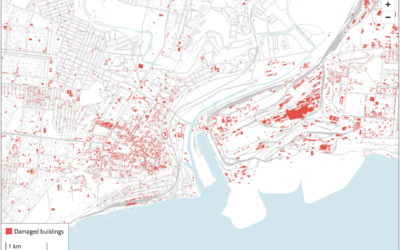
Using satellite imagery to assess the damage in Ukraine
The Economist combined two satellite imagery sources, one that estimates fire events and…

100 visualizations from a single dataset with 6 data points
The structure of a dataset can help you pick a visualization method or…

Greatest unexpected NBA performance
This is a fun one from Russell Samora and Reshad Malekzai for The…
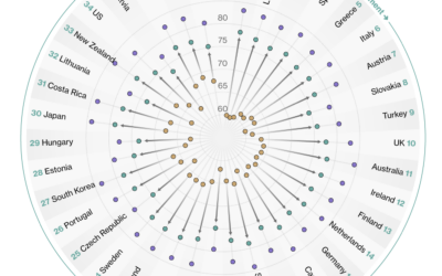
Countries with the longest healthy retirements
Bloomberg compared retirement years in the context of life expectancy and healthy life…

Map of homes bought with all cash
For The Washington Post, Emmanuel Martinez, Kevin Schaul and Hamza Shaban mapped the…