Visualization
Showing the stories in data through statistics, design, aesthetics, and code.
Possible field of vision from the helicopter seat
From the outsider point of view, a path towards collision might seem obvious,…

Golphe du Mexique, 1765
After a gulf rename, I got to browsing some historical maps. Jacques Nicolas…
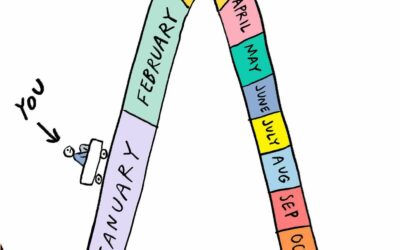
How time works
Cartoonist Becky Barnicoat illustrates the passing of time over a year. Seems right:…
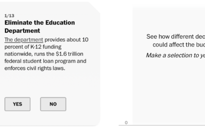
Try to cut $2 trillion from the federal budget
The “Department of Government Efficiency” wants to cut $2 trillion from the federal…
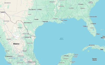
Gulf of Mexico changes to Gulf of America
The Gulf of Mexico has been renamed to the Gulf of America in…
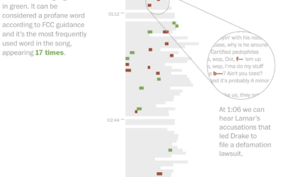
Leaving out keywords in a halftime show
I missed this one last week, pre-Super Bowl, but for The Washington Post,…
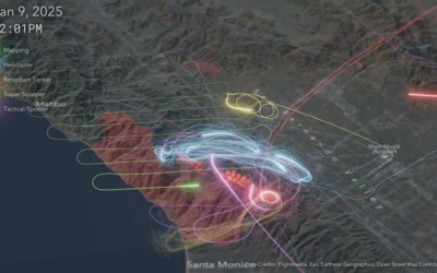
Flight map shows firefighting efforts
To contain the fires in Los Angeles, aircraft flew back and forth to…
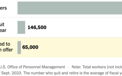
Federal worker resignations
According to the U.S. Office of Personnel Management, about 65,000 federal workers have…
Tracking daily federal expenditures
The Hamilton Project is tracking federal expenditures and updating daily:
This data interactive…

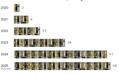
Book chart showing Barnes & Noble opening new stores
I assumed that Barnes & Noble was on its way out, but I…
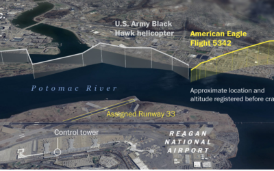
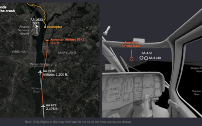
Mapping the American Airlines and Army helicopter collision
The Washington Post mapped the flight paths leading up to the collision over…

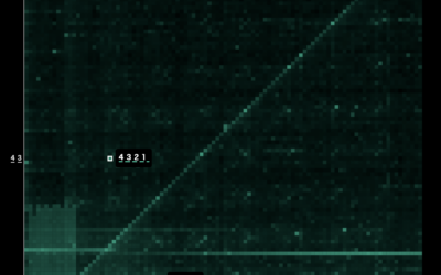
See wind data on Mars through tele-present wind
With the art installation tele-present wind, David Bowen displays data collected by NASA's Perseverance rover mission.
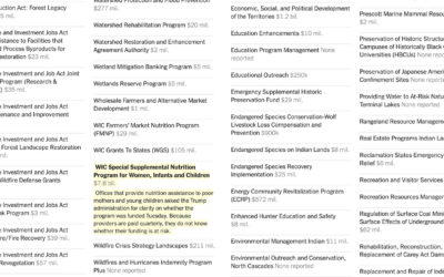
Federal programs under review
A spreadsheet of 2,600 grant and loan programs circulated to federal agencies, alongside…
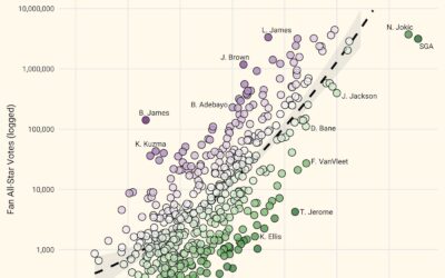
Overrated NBA all-star votes
NBA all-star voting is mostly for the fans, which means some players can…

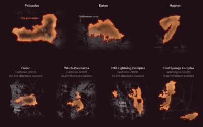
Fastest-growing and most destructive fires
Using satellite data, researchers analyzed the growth rate of 60,000 fires in the…