Visualization
Showing the stories in data through statistics, design, aesthetics, and code.
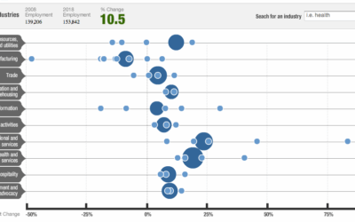
Future of Employment in the Decade Ahead
NPR shows projected employment changes from 2008 to 2018. Large circles represent major…
The Most Efficient Way to Type
Are you using the most efficient typing technique or are your fingers jumping…
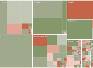
Obama’s Budget Proposal and Incorrect Forecasts
President Obama announced his 2011 budget proposal. How does it compare to last…
Flickr Group Treats – January 2010
I started the FlowingData Flickr group a little while ago, but didn’t come…
Save pens. Use Garamond font
Designers Matt Robinson and Tom Wrigglesworth looked at ink usage of some commonly-used…
Beatles Music in Infographics
I’m sure a lot of you love The Beatles. I’m not a huge…
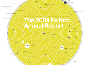
The 2009 Feltron Annual Report – OCD Made Sexy
Nicholas Felton’s personal annual report on his life is now up. For those…
Dropped Food. Should You Eat it?
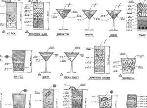
Since you’ll be trying every single drink recipe in the engineer’s guide this…
Data.gov.uk Gearing Up For Launch, er, Does Launch
Update: I had scheduled this post for next week, but apparently, Data.gov.uk launched…
The Very First Thematic Maps
I’m admittedly not very good with historical precedent, but I think we can…
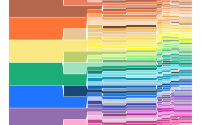
Crayola Crayon Colors Multiply Like Rabbits
In 1903, Crayola had eight colors in its standard package. Today, there are…
Data Visualization Christmas Ornaments
It’s funny how data is finding it’s way into everyday objects. There was…
Timescapes to Compare Chopin Recordings
How do you compare music visually? You can break it down into data…
The Geography of Netflix Rentals
Some movies are popular everywhere. Others are popular only in certain regions. The…
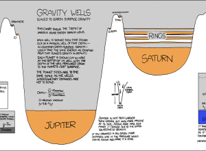
Need to Escape Jupiter’s Gravitational Pull? Good Luck
Randall of xkcd has been having fun with data visualization lately. In his…
Even Older Infographics from the 19th Century
Old graphics are awesome. We saw some from the 1930s already. These are…
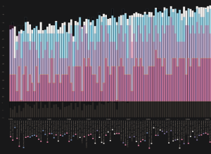
A Visual History of Loudness in Popular Music
All Things Considered discusses why music sounds worse than it did a few…

