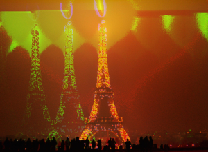
Celebrating the 25th anniversary of the fall of the Berlin Wall, Lightgrenze, translated…
Data Art
Finding the beauty in numbers.
-
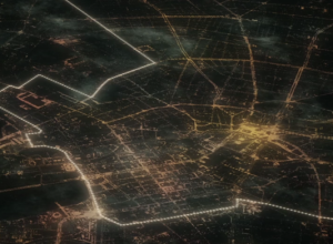
Berlin wall of lighted balloons
-
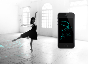
Ballet dance traces
Electronic Traces, by Lesia Trubat, tracks ballet movements and allows dancers to see…
-
Geographic smell maps
Kate McLean, a PhD candidate in Information Experience Design at the Royal College…
-
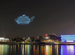
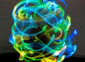
Drones programmed for light painting in the sky
What do you get when you put LEDs on a system of drones…
-
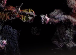
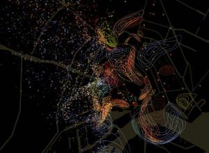
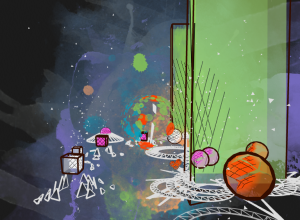
Quartet point cloud
This is beautiful to watch. Graham Roberts, Daniel J. Wakin, and others from…
-
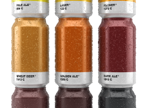
Pantone beer cans
Graphic designer Txaber created beer can labeling to match the typical color of…
-
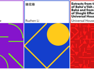
Generative book covers
The New York Public Library is developing an eBook-borrowing system, which includes an…
-
Beat Blox
Beat Blox is a student project by Per Holmquist from Beckmans College of…
-
Graph-based video game
Last year, Metrico, an infographic-based puzzle game for the PlayStation Vita, was announced…
-
Face tracking coupled with projection mapping
Projection mapping — the use of projected images onto physical objects to turn…
-

FuelBand Fibers visualizes daily activities beautifully
Leading up to a Nike women’s 10k run, design studio Variable made FuelBand…
-
Wi-Fi strength revealed in physical space →
Digital Ethereal is a project that explores wireless, making what’s typically invisible visible…
-
Editing photos as if they were audio files →
Masuma Ahuja and Denise Lu for the Washington Post applied a technique called…
-
Voter approval rates as butt plugs
From a couple of years ago, but still relevant, I think. Matthew Epler…
-

Filing cabinet follows people around, like a data trail
Jaap de Maat, a graduate student at the Royal College of Art, rigged…
-

Data Cuisine uses food as the medium
Ditch the computer screen for your data. It’s all about the food. Moritz…
-
Bass Shapes visualizes sound in hand-drawn style
Media artist Nick Hardeman’s audio visualization app Bass Shapes was rejected by the…
-
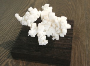
Crystal clusters of world data
Artist Scott Kildall generates what he calls World Data Crystals by mapping data…
Recently for Members
Second Edition
 Visualize This: The FlowingData Guide to Design, Visualization, and Statistics (2nd Edition)
 Visualize This: The FlowingData Guide to Design, Visualization, and Statistics (2nd Edition)
New tools, refined process.
Browse by Chart Type See All →


