Projects
Graphics by Nathan Yau, borne out of everyday curiosities, learning experiments, and mild insomnia.
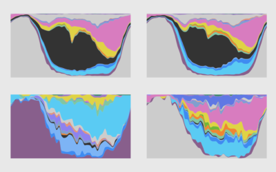
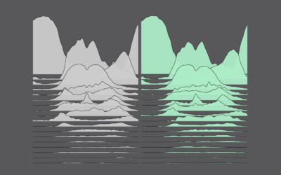
How Men and Women Spend Their Days
Using an oldie but goodie visualization format to look at time use between different groups.
How Much More Time We Spent at Home
We had to do more from home. Here's how much everything shifted by total minutes in a day.
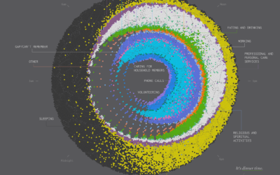
Cycle of Many, a 24-hour snapshot for a day in the life of Americans
This is a 24-hour snapshot for a day in the life of Americans.
Daily Routine, 2020
After looking at how much time we spent on daily activities in 2020, let's look at when we spent our time.
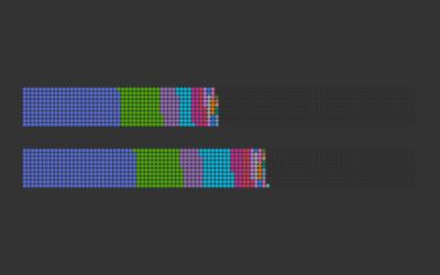
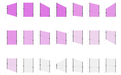
How We Spent Our Time in 2020 Versus 2019
Our everyday routines changed over the past year, and with the 2020 American Time Use Survey, we can see by how much.
Counting Happiness and Where it Comes From
Researchers asked 10,000 participants to list ten things that recently made them happy. I counted and connected the dots.
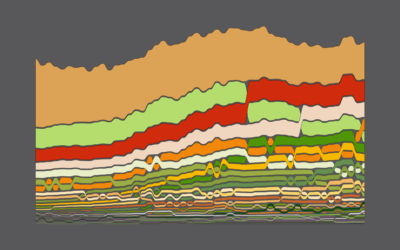
Seeing How Much We Ate Over the Years
How long will chicken reign supreme? Who wins between lemon and lime? Is nonfat ice cream really ice cream? Does grapefruit ever make a comeback? Find out in these charts.
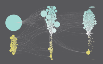
Jobs that Marry Together the Most
Find out which jobs most often pair together among married couples.
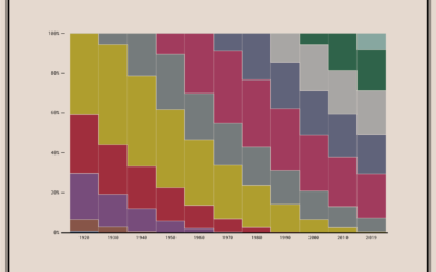
Coming and Going Age Generations
Since no one has figured out how to defeat time, age generations come and go. This chart shows the generational breakdowns since 1920.
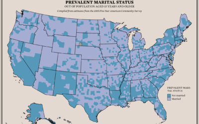
Where People are Married and Not
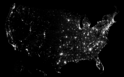
About 48% of the U.S. population aged 15 and older is married. I was curious if there were regional variations, so I mapped it.
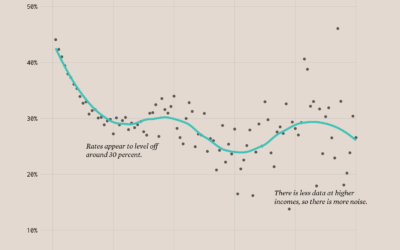
Divorce Rates and Income
Divorce rates are tied to job security, age, and occupation, so it should make sense that we see a pattern when we plot divorce rates against income.
Population Growth and Seats Gained
The Census Bureau released state population counts for 2020. Here's how each state gained and lost population and seats.
Surprise, Less Happiness During Pandemic
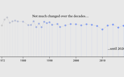
Since 1972, the General Social Survey has asked people about their happiness. It never changed much — until 2020 happened.
Tooth Fairy Exchange Rate
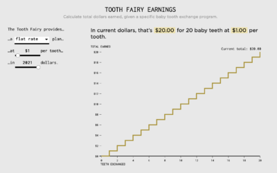
Calculating how much money a kid gets after exchanging all twenty baby teeth.

