It’s no secret. The US military gets a lot of funding for manpower,…
Data Art
Finding the beauty in numbers.
-
Military budget contextualized with CGI tanks
-
Field guide to typographic moustaches
Sure, why not, let’s make it a hairy Friday. From Tor Weeks: a…
-
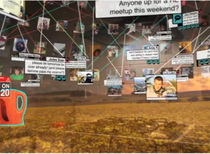
Augmented reality taken to the extreme
Augmented reality, a computer trick to place the virtual within the real world,…
-
Facts and figures of London life
Field Design takes a look at a day in London:
LDN24 is a… -
Music animation machine
Anyone can listen to music, but how can you see it? The Music…
-
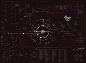
Taxonomy of the iPhone
Ben Millen diagrams the reach of the iPhone in our everyday lives:
These… -
Graphical data fiction
We like to talk about the stories in data. They are the information…
-
Twitter parade in your honor
This is completely useless in the good sort of way. Twitter parade, by…
-
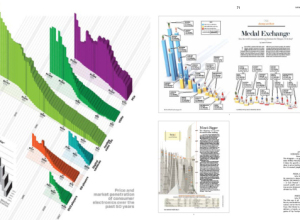
Review: Data Flow 2, Visualizing Information in Graphic Design
Note: The review copy I received is in French. Unfortunately, I only understand…
-
Twitwee the Twitter cuckoo clock
I love it when data, or in this case, tweets, finds itself in…
-
Design of Frank Lloyd Wright’s Masterpiece
In 1934, American architect Frank Lloyd Wright designed Fallingwater, a house built partly…
-
Dreaming in numbers
Cristobal Vila, inspired by, well, numbers and nature, Vila animates the natural existence of Fibonacci sequences, the golden ratio, and Delaunay triangulation. Watch it. Even if you don’t know what those three things are, the video will rock your socks off.
-
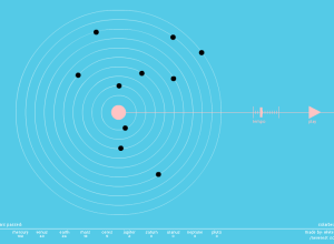
Planets make sweet music together
SolarBeat is an audiolization by Whitevinyl that makes music with the planets. Each…
-
Cultural colors of emotion and character
Some colors represent different things in different parts of the world, while others…
-
Connections among Twitter employees
Because you can never get enough Twitter visualizations, Jason Stirman takes a look…
-
Clothing color palette
Jacobo Zanella makes a color palette every day, based on the clothes he’s…
-
Crowdsourcing Johnny Cash
Aaron Koblin (along with Chris Milk) is up to his crowdsourcing mischief again.…
-
Wear the weather as a bracelet
We all know that data is the new sexy, so it’s only natural…




 Visualize This: The FlowingData Guide to Design, Visualization, and Statistics (2nd Edition)


