I’m not sure what I’d do with Ablaze.js, a JavaScript library by Patrick…
Nathan Yau
-

Make cool images with emergent algorithm
-
Link
Probability and Statistics Cookbook →
Open source PDF, although looks pretty technical on first glance
-
Link
Data Is Useless Without the Skills to Analyze It →
And visualization is useless without data; you do the math.
-
Animated political contributions
The Forest of Advocacy is a series of animations that explores the political…
-
Link
Google Bacon Number →
When you Google “bacon number” followed by an actor’s name, you’ll get the degrees of separation
-
Link
Comparing Map Projections →
Slick demo showing what projections preserve and lose
-
Soundscapes of city pollution
Aaron Rueben and Gabriel Isaacman used data from sampling air in tunnels, where…
-
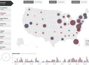
Presidential campaign stops mapped →
Emily Chow, Ted Mellnik, and Karen Yourish for The Washington Post mapped where…
-
Link
Networked Life →
New course on how social, economic and technological structures interact
-
Link
Infographics Education →
Video tutorials on using Illustrator by professor Mike Wirth
-
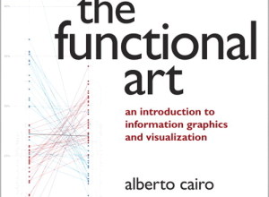
Review: The Functional Art
Alberto Cairo’s newly translated book on information graphics, The Functional Art, is a…
-
Link
Scraping HTML with Google Docs →
Old, but I keep coming back to it. Simple use of ImportHtml() function brings an HTML table into spreadsheet
-
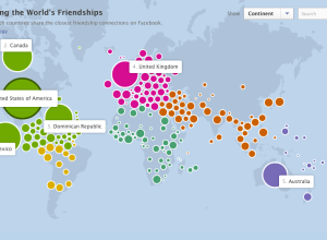
How people are connected on Facebook, by country
As part of the Stories initiative that Facebook launched yesterday, an interactive map…
-
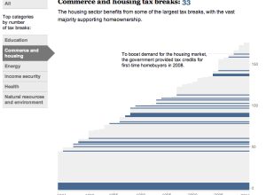
History of tax breaks →
Kat Downs, Laura Stanton and Karen Yourish of The Washington Post look at…
-
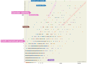
Wikipedia is dominated by male editors
After he saw a New York Times article on the gender gap among…
-
Link
Building a Bubble Cloud →
Tutorial based on the NYT graphic on word use at the National Conventions
-
Link
Some ggplot2 themes →
Including the Economist, Stata, and oh yes, Excel 2003 [via]
-
Humans predicting the weather
Nate Silver says the weatherman is not a moron.
Still, most people take… -
Link
Art and Design continuum →
From data graphics to art, it’s a continuous spectrum; last sentence of article includes a lot more people though
-
Link
Hacker Journalism 101 →
A wishful syllabus by NPR news app head
Recently for Members
Second Edition
 Visualize This: The FlowingData Guide to Design, Visualization, and Statistics (2nd Edition)
 Visualize This: The FlowingData Guide to Design, Visualization, and Statistics (2nd Edition)
New tools, refined process.
Browse by Chart Type See All →


