Best Data Visualization Projects of 2024

Many datasets were analyzed and many charts were made this year. If I liked a project, it was on FlowingData. But only a handful can be the best. These are my favorite data visualization projects from 2024.
Liuhuaying Yang
This is Not My Name
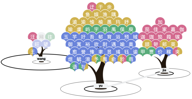
I kind of knew about the convergence of Chinese names from experience, but this research project taught me something new. The audio pronunciation helps too. [See the Project / On FlowingData]
NASA Landsat Science
Your Name In Landsat
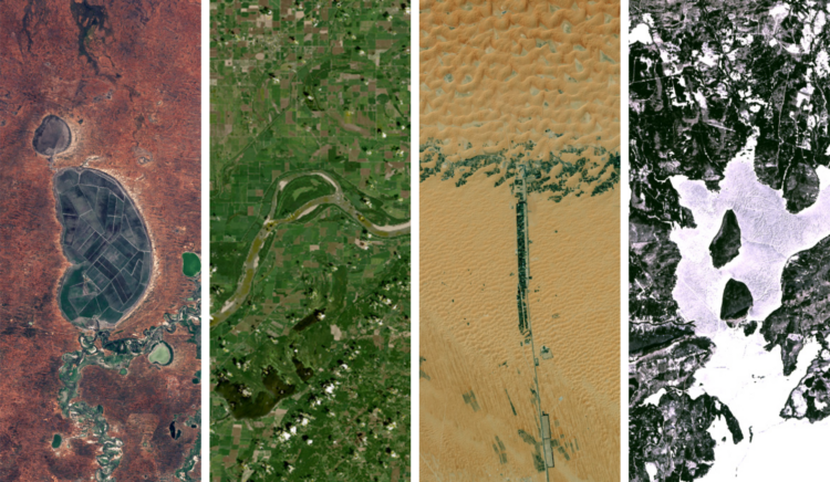
This caught me off guard in a good way. NASA should make more things with fun and quirks, alongside the isn’t-space-amazing videos. [See the Project / On FlowingData]
German Federal Foreign Office
Climate—Conflict—Vulnerability Index
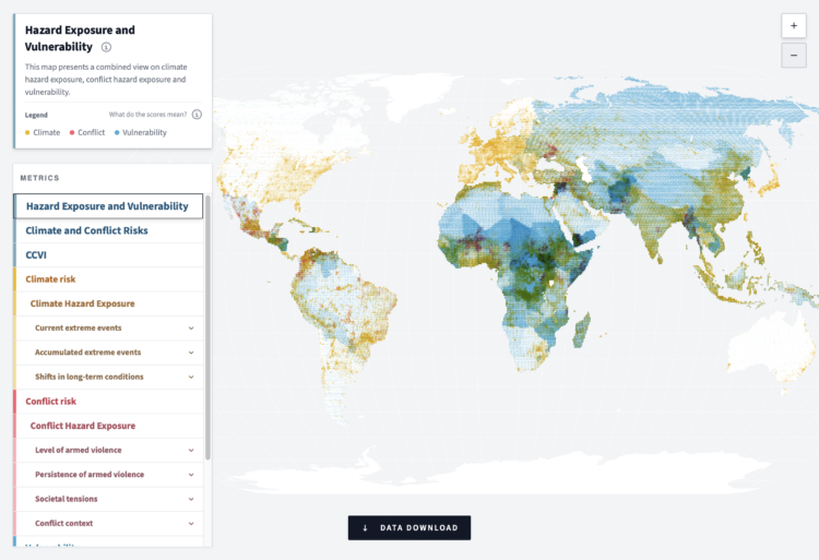
The point is to create and maintain a dataset so that we can understand the changing risks worldwide. The interactive map helps you understand the data. [See the Project / On FlowingData]
Aatish Bhatia for The New York Times’ Upshot
When A.I.’s Output Is a Threat to A.I. Itself
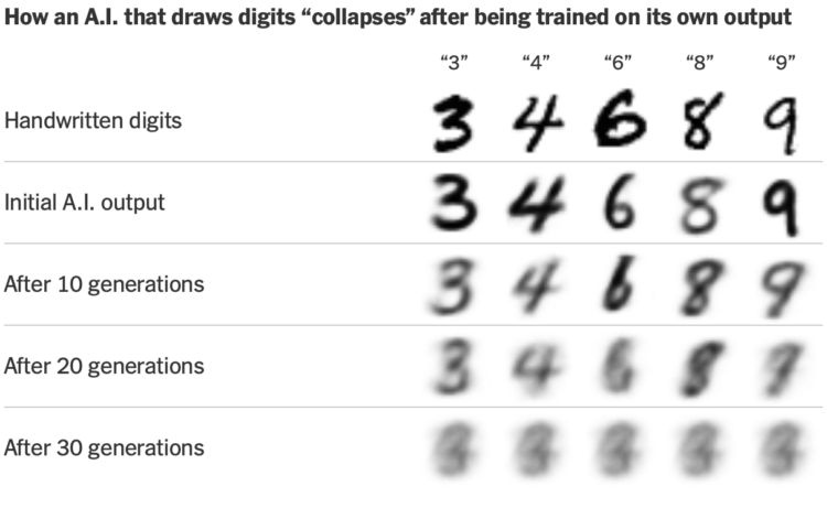
There were quite a few projects that demonstrated the convergence that is AI output, but this one stood out for showing how we get there. [See the Project / On FlowingData]
Epic Spaceman
I shrink 10x every 21s until I’m an atom
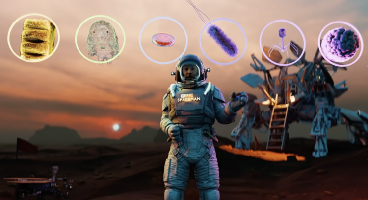
It is impossible to tire of seeing the scale of all the things. I appreciated the focus on relative size over the unit measures. [See the Project / On FlowingData]
Dominikus Baur and Alice Thudt
Full Of Themselves
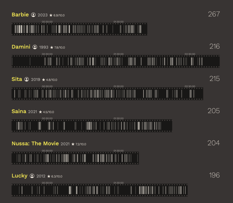
I truly enjoy the unnecessary explorations of small curiosities. Plus they led with Back to the Future. [See the Project / On FlowingData]
Alex Lim, Katia Shatoba, and Thomas Brettell, for ABC News
The mullet is alive and well in AFL
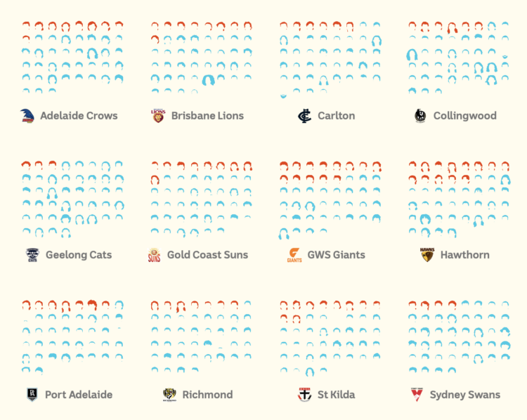
One thing you don’t know about me is that I had a mullet when I was a kid. A really bad one. This work resonated with me. [See the Project / On FlowingData]
Sudev Kiyada, Han Huang, Adolfo Arranz, and Simon Scarr, for Reuters
A torrent of trash

The illustrated balloons with bags of garbage attached are perfect as you scroll. [See the Project / On FlowingData]
Jan Diehm and Michelle Pera-McGhee for The Pudding
The United States of Abortion Mazes
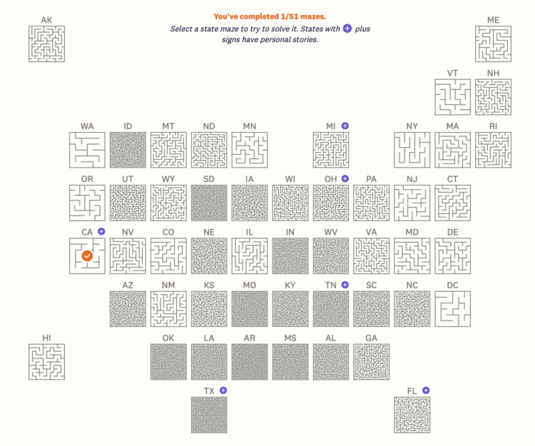
The metaphor and playable mazes for each state were perfect. [See the Project / On FlowingData]
Natalie Lung, Leon Yin, Aaron Gordon, and Denise Lu for Bloomberg
How Uber and Lyft Used a Loophole to Deny NYC Drivers Millions in Pay
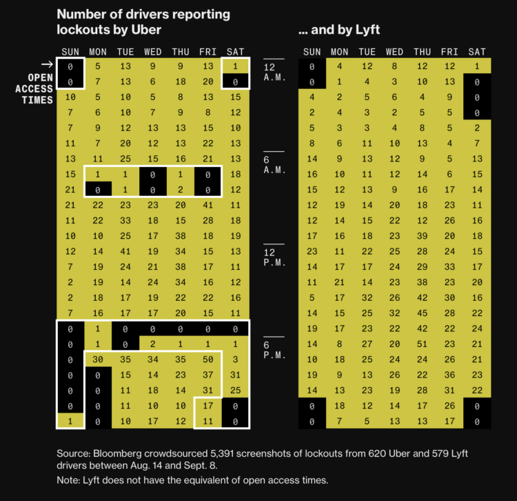
The ad hoc data collection yielded a clear pattern across Uber drivers. [See the Project / On FlowingData]
Jan Willem Tulp
Parallel Lives
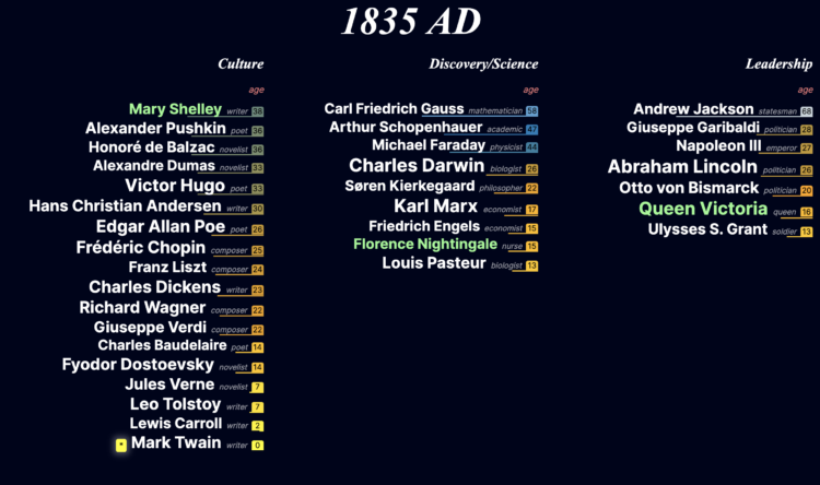
As a middle-age person feeling middle-age things, I appreciated seeing the age of notable people throughout history. [See the Project / On FlowingData]
Great stuff all around. Solid work, everyone.
My only wish for next year is to keep the fun in data and visualization. Explore random curiosities deeply. Try new visual forms. With a big shift in the U.S. on the way, I’m remembering the seriousness that landed last time. This is necessary, but let’s not forget the joy.
See the best of the best from previous years: 2008, 2009, 2010, 2011, 2013, 2014, 2015, 2016, 2017, 2018, 2019, 2020, 2021, 2022, and 2023.
Become a member. Support an independent site. Get extra visualization goodness.
See What You Get
