Tutorials
Visualize your data like an expert with hundreds of practical how-tos for presentation, analysis, and understanding.
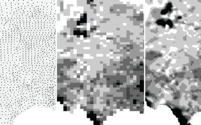
Transitioning Map, Part 1: Mapping Irregular Data with Interpolation in R
Rarely do you have evenly-spaced data across an entire geographic space. Here is a way to fill in the gaps.

How to Visualize Proportions in R
There are many ways to show parts of a whole. Here are quick one-liners for the more common ones.
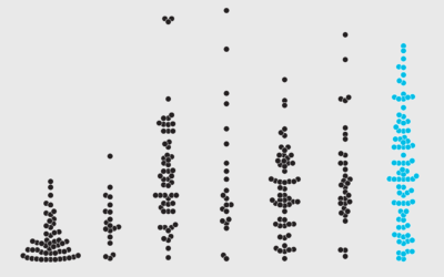
How to Make Beeswarm Plots in R to Show Distributions
Try the more element-based approach instead of your traditional histogram or boxplot.
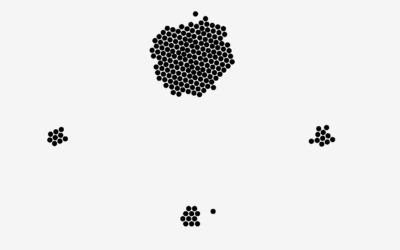
Make a Moving Bubbles Chart to Show Clustering and Distributions
Use a force-directed graph to form a collection of bubbles and move them around based on data.
How to Make Square Pie Charts in R
Instead of traditional pie charts that rely on angles and arc lengths to show parts of a whole, try this easier-to-read version.
Annotating Charts in R
Let the data speak for itself they say. That doesn't work a lot of the time, and when that happens, you need to explain.
A Course for Visualizing Time Series Data in R
Learn to visualize temporal patterns in a couple of days.

Drawing Circles and Ellipses in R
Whether you use circles as visual encodings or as a way to highlight areas of a plot, there are functions at your disposal.

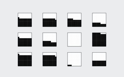
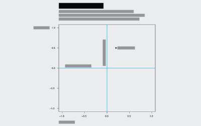
Drawing Squares and Rectangles in R
R makes it easy to add squares and rectangles to your plots, but it gets a little tricky when you have a bunch to draw at once. The key is to break it down to the elements.
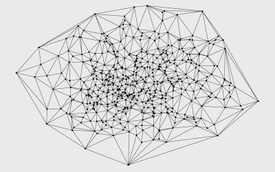
Voronoi Diagram and Delaunay Triangulation in R
The
deldir package by Rolf Turner makes the calculations and plotting straightforward, with a few lines of code. 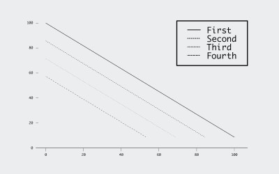
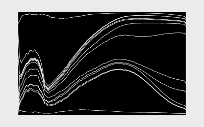
How to Make an Interactive Stacked Area Chart
Stacked area charts let you see categorical data over time. Interaction allows you to focus on specific categories without losing sight of the big picture.
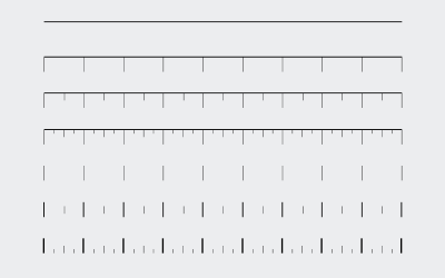
How to Customize Axes in R
For presentation purposes, it can be useful to adjust the style of your axes and reference lines for readability. It's all about the details.

How to Make an Interactive Bar Chart With a Slider
Provide a slider for the standard bar chart so that users can shift focus to a point of interest.
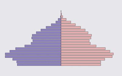
How to Make an Animated Pyramid Chart in R
Make a bunch of charts, string them together like a flip book, and there's your animation. Sometimes good for showing changes over time. Always fun to play with.
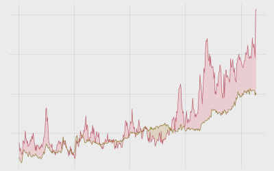
How to Make Bivariate Area Charts in R
Quickly compare two time series variables with this line-area chart hybrid that originated in the 1700s. Also known as: difference chart.
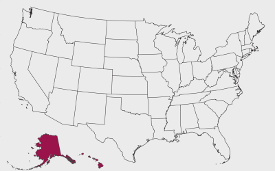
How to Make Maps in R That Include Alaska and Hawaii
The conterminous United States always gets the attention, while Alaska and Hawaii are often left out. It is time to bring them back into view.