Tutorials
Visualize your data like an expert with hundreds of practical how-tos for presentation, analysis, and understanding.
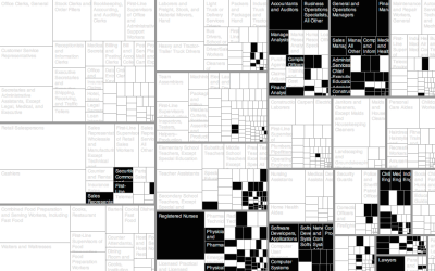
How to Make an Interactive Treemap
Treemaps are useful to view and explore hierarchical data. Interaction can help you look at the data in greater detail.
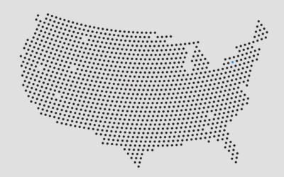
How to Make Gridded, Equal-Distance Dot Maps
For when your geographic data is evenly spread rather than aggregated by government boundaries.
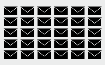
Downloading Your Email Metadata
Email provides a window into who we interact with and what we do. This tutorial describes how to get that data in the format you want.
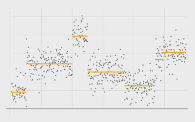
Detecting and Plotting Sequence Changes
Change detection for a time series can be tricky, but guess what, there's an R package for that. Then show the results in a custom plot.
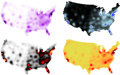
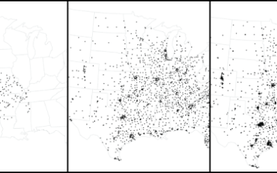
How to Make Smoothed Density Maps in R
Too many points to plot often means obscured patterns in the clutter. Density maps offer a smooth alternative.

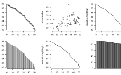
How to Read and Use Histograms in R
The chart type often goes overlooked because people don't understand them. Maybe this will help.
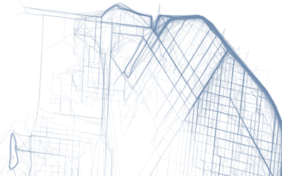
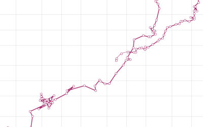
How to Map Geographic Paths in R
As people and things move through a place, it can be useful to see their connected paths instead of just individual points.
The Baseline and Working with Time Series in R
A big part of statistics is comparisons, and perhaps more importantly, to figure out what to compare things to. Perspective changes with the baseline.
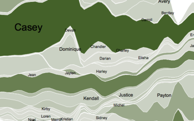
How to Display Text in R
Text can provide much needed context to traditional visual cues and can be used as a visual cue itself in some cases.
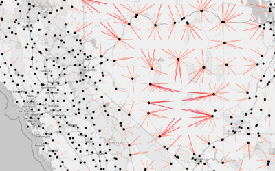
Working with Line Maps, the Google Places API, and R
A frequent challenge of visualization is behind the scenes, to get the data and to mold it into the format you need. Do that. Then map.
How to Make a Connected Scatter Plot
The combination of a time series chart and a scatter plot lets you compare two variables along with temporal changes.
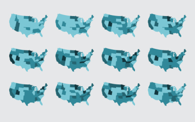
Small Maps and Grids
Maybe you want to make spatial comparisons over time or across categories. Organized small maps might do the trick.
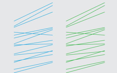
How to Make Slopegraphs in R
Also known as specialized or custom line charts. Figure out how to draw lines with the right spacing and pointed in the right direction, and you've got your slopegraphs.

Small Multiples in R
Make a lot of charts at once, line them up in a grid, and you can make quick comparisons across several categories.
How to Make an Animated Growth Map in R
Although time series plots and small multiples can go a long way, animation can make your data feel more real and relatable. Here is how to do it in R via the animated GIF route.
Using Transparency in R to Improve Clarity
When you plot a lot of data at once, points and lines can obscure others and hide patterns. Transparency can help reveal what is really there.
How to Animate Transitions Between Multiple Charts
Animated transitioning between chart types can add depth to your data display. Find out how to achieve this effect using JavaScript and D3.js.
Getting Started with Charts in R
You get a lot of bang for the buck with R, charting-wise, but it can be confusing at first, especially if you've never written code. Here are some examples to get started.