For NBC News, Jane Weaver, Jiachuan Wu, and Javier Zarracina report on the…
Statistical Visualization
Finding patterns, distributions, and anomalies.
-
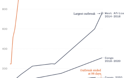
Ebola outbreak trajectories
-
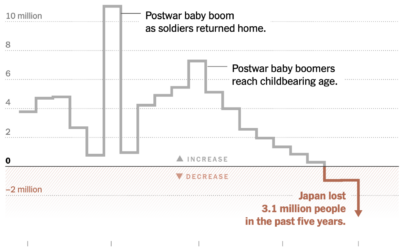
Population in Japan continues decline
Japan has been aging and having fewer children, which led to a decline…
-
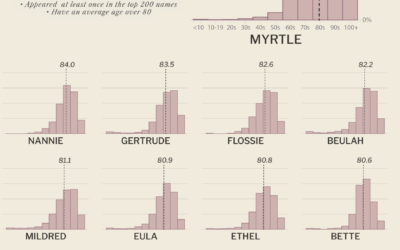
U.S. names with the oldest population
Erin Davis calculated the average age of people with a given name to…
-

Voters shifting away from the two-party system
U.S. voters have historically stuck with two political parties, but that’s changing in…
-
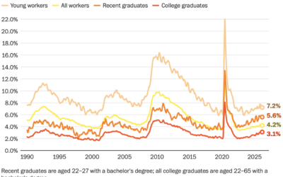
More difficult for recent graduates to find jobs
For the Washington Post, Federica Cocco and Taylor Telford report on the increasing…
-
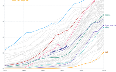
Declining birth rates globally
Birth rates are falling nearly everywhere. For Financial Times, John Burn-Murdoch explores why…
-
Analysis of similes in literature
For the Pudding, Russell Samora, with design and illustration by Shelly Tan, analyzed…
-
Atlas of Global Development
World Bank, which releases an atlas every few years, published an Atlas of…
-
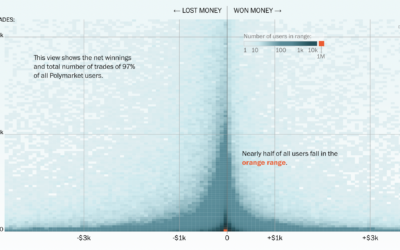
More people losing money in prediction markets
For the Washington Post, Jeremy B. Merrill and Leslie Shapiro visualized users who…
-
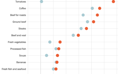
Rising prices at the grocery store
The U.S. Bureau of Labor Statistics published cost estimates for April 2026. If…
-
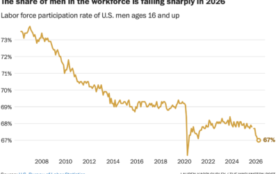
Men leaving the workforce
The percentage of U.S. men in the workforce has been declining for decades,…
-
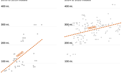
EVs getting cheaper to go farther
The cost of an electrical vehicle used to increase quickly as you shopped…
-
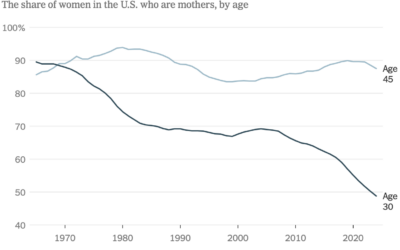
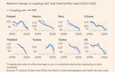
Lower fertility, probably delayed
Lower fertility is typically pitched as a bad thing, but it can be…
-

Causes of death around the world for different groups
Mortality varies widely by geography and demographic group. It has also changed over…
-
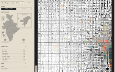
Data portraits of population
To make India’s census documents more accessible to the public in the 1970s,…
-
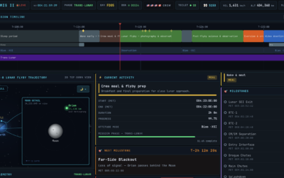
Artemis II tracker, to know if the space toilet is working
NASA makes a lot of live data available about the Artemis II mission.…
-
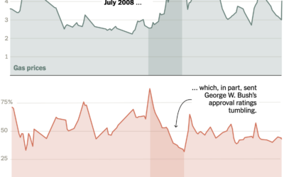
Approval ratings vs. high gas prices
For the New York Times, Ruth Igielnik and Katherine Chui charted presidential approval…
-
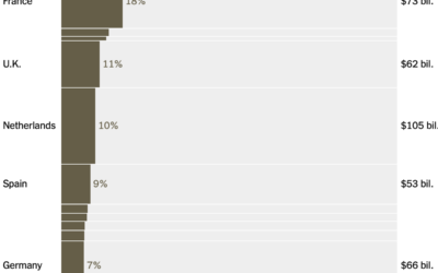
Oil imports from the Middle East, by country
Lazaro Gamio and Josh Holder for the New York Times break down energy…
Recently for Members
Second Edition
 Visualize This: The FlowingData Guide to Design, Visualization, and Statistics (2nd Edition)
 Visualize This: The FlowingData Guide to Design, Visualization, and Statistics (2nd Edition)
New tools, refined process.
Browse by Chart Type See All →


