Projects
Graphics by Nathan Yau, borne out of everyday curiosities, learning experiments, and mild insomnia.
Most common use of time throughout the day, by age and sex
See how common activities were for a given time of day, age, and sex.
Marital Status Shifts in the United States
People stay single longer, marry later, divorce less, and widow older.
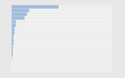
Fireworks-related emergency department visits
You might be surprised that the combination of beer and fireworks doesn't always work out.
Relationships outside an appropriate age range
People tend to marry or partner with those closer to their age. However, some venture outside the typical range.

Married by When
Because everyone who is 30 years and older loves getting asked when they're going to settle down and get married.
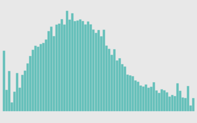
American Crying
People cry for different reasons and some tend to cry more than others. What makes people cry the most?
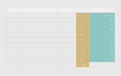
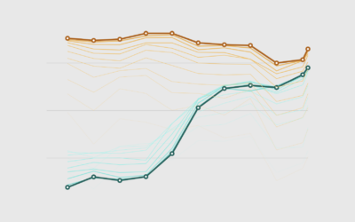
Stock Market Recovery Time, a Long-Term Perspective
Households are seeing the value of their savings decrease significantly over a short period of time. Now seems like a good time to take the long-term point of view.
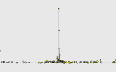
When You Will Die
With absolute certainty, you will die. When will it happen? That is a trickier question. But we can run simulations to explore the possibilities.
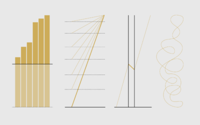
Defense Against Dishonest Charts
This is a guide to protect ourselves and to preserve what is good about turning data into visual things.

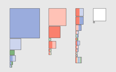
Work Cohorts
See how many people are in various work cohorts, given education, annual income, weekly hours, and commute time.
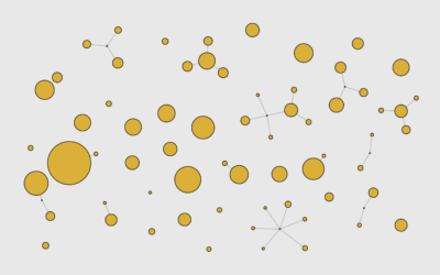
Network of Supermarket Chains
Here's the current landscape of supermarket parent companies and their subsidiaries — national chains, regional, local, co-ops, specialty, ethnic, and discount.
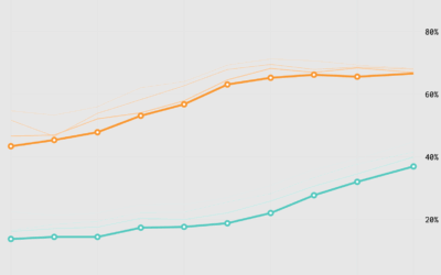
Where Health Insurance Comes From in the United States
About half of people have private health insurance through an employer. However, the other half get their insurance from elsewhere or through a combination of sources.
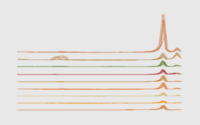
Peak Thanksgiving Food
One of the highlights of Thanksgiving in the United States is the food, as seen through the lens of Google Trends.
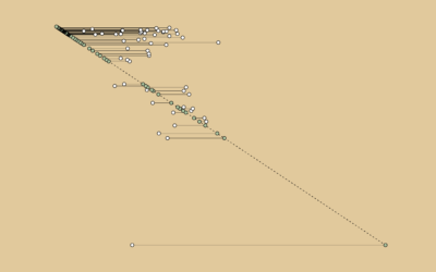
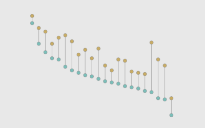
Mike Tyson Fights Against Age
A timeline showing the age difference between Mike Tyson and his opponents, over his career that started in 1985.
Employment Rates and Age, More Work and More Years
We can see the changing scales of who works and for how long through employment rates by age and time.