Largest data breaches of all time

As I’m sure you know, Sony has been having all sorts of data breach problems lately — namely a million passwords from the Sony Pictures site, 77 million accounts from the PlayStation Network, and nearly 25 million user accounts from Online Entertainment. I was curious how these recent attacks compared to the largest known data loss incidents, so I headed over to DataLossDB. Sony now holds spots #4 and #10 for largest breaches of all time. That can’t be good.
Below: a timeline of all known Sony data breaches so far this year, the biggest on April 26 and the second biggest soon after on May 2. More to come?

Chart Type Used

35 Comments
Become a member. Support an independent site. Get extra visualization goodness.
See What You Get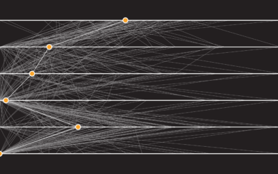
Great work, Nathan! Beautiful and insightful!
Thanks, Jan :)
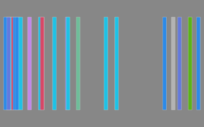
Great resource, but have I missed the legend for the color codes identifying the breach type?
I am looking for the same key
Colors indicate the type of breach: fraud, lost, stolen, hacked
nun: Does green indicate fraud? Lost? Does blue indicate hacked? Does invisible with pink and purple polkadots mean stolen?
And now I fail for not noticing the blatant text above each grouping
neat graphics. Like Peter said…it hints at the color codes, but I’m curious what it means. Maybe if I buy the book I’ll find out! :)
The color codes correspond to the type of loss. Green is “hacked”, blue is “lost” etc. No key is necessary but the color coding differences aren’t apparent at first glance.
thanks! …I clearly missed that one.
@Will – I guess I should’ve made it a little more clear. I just added a little bit more text so that it’s more obvious.
It would be nice if there were a hyperlink to at least one news article describing the breach available to get further information. This is one of the more trusted of the sources I’ve found for further data. http://www.privacyrights.org/data-breach
@Larry – The previously mentioned DataLossDB also does a good job at keeping up-to-date information about data breaches. They keep record of new incidents and include links to new sources for more information.
So if one aggregates the recent April/May Sony breaches together, that puts them ‘securely’ in the #2 spot overall.
I have been watching the news, but haven’t seen anything that shows what Sony’s doing to soothe customers.
Nathan, I very much enjoy your work. But, I’m wondering if you have ever studied InfoVis outside of statistics? I can’t tell if you are aware that visualizing data is a defined discipline both academically and practically that people get degrees in? Have you looked at Stephen Few’s, E. Tufte, Ben Schniederman or A. Ware’s work. Some of the issues I see cropping up here, like making the color coding more obvious, are covered in their works. Just wondering.
I ordered your book by the way, looking forward to reading it.
@DED – Yep, I’ve studied the work of all those you mentioned. And I also like to experiment.
Enjoy the book!
Yes, it is good to experiment. With the color coding in your graph, there is some work in educational psychology that addresses the issue of proximity when labeling graphical material. I noticed in your graph that the user has to make two mental steps to relate the color with the words : fraud, hack, and lost. The first is to find the word, and the second is to mentally connect the particular word with the color. I had trouble with it at first, mostly because the word in question didn’t stand out from the surrounding text. And then because I had to look at several elements before noticing the pattern.
Maybe highlighting the important word in each element would help.
The biggest incident that came to my mind is this one (affecting 25 million people — including the names, addresses and dates of birth of essentially every child in the UK):
http://en.wikipedia.org/wiki/Loss_of_United_Kingdom_child_benefit_data_(2007)
I wonder why that’s not in there?
Nathan,
Did you do this in R? Is there any way to post the code or a link to it? Just curious to expand my R horizons. Thanks.
Mike
@Mike N – I did this in Illustrator, but have done something similar to this in R using base graphics. I’ll try to put together a tutorial some time.
Sure no worries or hurry. I’m just trying to get better at creating these kind of graphics using R so if it was easy/available… Thanks!
MN
I’m confused by RockYou, Inc. and HM Revenue and Customs. The numbers and dates are the same, but the rankings and block sizes are different.
@FP – Good catch. Fixed.
How do you define a “record” though? I wonder if they may be counting certain backups as their own recod.
Please get to know @londesc ().
It would seem that your blog does not permit legitimate links. In any case, please look into the @longdesc attribute.
Nathan,
This is good!
You may want to add detail like Spear Phishing, RSA hack-related, Adobe Zero-Day, etc. because it helps gives context on trends to how companies were exploited.
I’m also interested to see what the losses were like post-incident. How big were the fines? Court information?
What happened to the bad guys? Jail? Slap on the wrist?
Thanks for putting this together.
Phil Agcaoili
I have been to one of Tufte’s workshops. It was very good. And the cost of the workshop includes all the books he’s published. Well worth it.
Do you have back track link so I can post this on my blog?
try using http://attrition.org/security/rant/sony_aka_sownage.html for your timeline, there’s a few more events that you’re missing
I’d be tempted to color the words of “(hacked, stolen, lost, or fraud)” by the color used to represent them in the actual charts. That would make it easier to see what the colors represent, but is there a downside to doing that?
I’m really looking forward to getting your book!
It would be nice to include a link to a news story about each of these data breaches or some sort of citation information. Otherwise, very nice rendition.
Do these chart types (the top one) have a name? I’ve been searching all over the place looking for a name for this type of chart and I can’t find one. If I were to name them, I’d call them “particle charts”.
Looks like they are called unit charts.
http://www.perceptualedge.com/articles/visual_business_intelligence/unit_charts_are_for_kids.pdf
-Sean
What about Lockheed and Martin? Or not significant enough?