Like I mentioned before, Robert Kosara (EagerEyes), Andrew Vande Moere (information aesthetics) and…
2009 October
-
Join Us in Atlantic City this Sunday – VisWeek Workshop
-
Trendsmap Shows Twitter Trends Geographically
Twitter shows trending topics, but it’s for the entire user base. You can…
-
NYC BigApps Competition – $20k In Prize Money
It’s exciting times for data heads. The launch of Data.gov back in May…
-
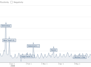
Facebook Measures Happiness in Status Updates
As we all know, Facebook lets people update their friends with status updates,…
-
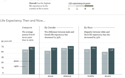
How Long People Live in America
In this graphic, we take a look at some data on how long…
-
30 Resources to Find the Data You Need
Let’s say you have this idea for a visualization or application, or you’re…
Recently for Members
Second Edition
 Visualize This: The FlowingData Guide to Design, Visualization, and Statistics (2nd Edition)
 Visualize This: The FlowingData Guide to Design, Visualization, and Statistics (2nd Edition)
New tools, refined process.
Browse by Chart Type See All →


