This is the 300th weekly issue of The Process. Have things changed? Do we visualize data differently now? Where is this headed?
options
Have a tricky dataset to visualize? Consider the options, based on what you want to show.
-
Members Only
Shifting Visualization Process, 300
-
Members Only
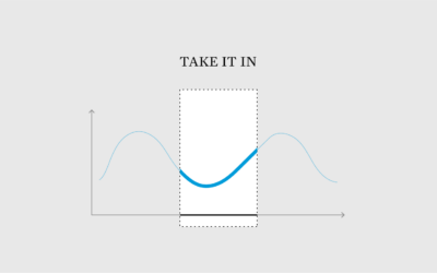
Chart Options to Cut Through the Noise and See Patterns
Sometimes the noise in a dataset makes it hard to see the worthwhile patterns when you visualize it. Here are chart options for you.
-
Members Only
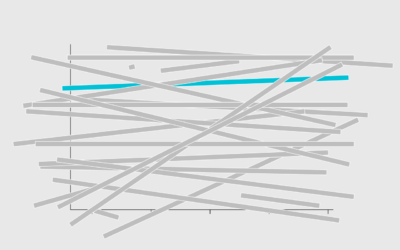
Chart Options When the Differences are Small But Worthwhile
Small changes over time or small differences between categories can easily look insignificant, even if they’re worth noting in real life. Here are chart options for you.
-
Members Only
Unlimited Chart Options
We often talk about visualization in terms of restrictions and rules, as if you must limit your possibilities to make charts the right way. As you might have guessed, there are other options.
-
Members Only
Chart Options When You Have Little Space
As more charts shift to smaller screens, we have to find ways to save space but keep the data readable. There are options.
-
Members Only
Chart Options When You Need to Fill Space
Maybe you’ve run into the rare situation/blessing of too much space, and you’re not sure how to fill it. There are options.
-
Members Only
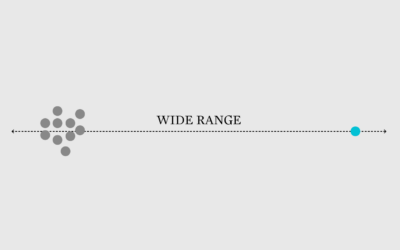
Chart Options for When the Scale is Squished by the Full Range of Data
Welcome to The Process, where we look closer at how the charts get…
-
Members Only
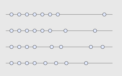
Chart Options for When Time Data Has Uneven Gaps
Visualizing time series data often assumes that your data points are evenly spaced over time, which is not always the case.
-
Members Only
Chart Options for When You Have Lots of Categories
A long bar chart can be a bit much, so here are simple options to make it less jumble-ish.


 Visualize This: The FlowingData Guide to Design, Visualization, and Statistics (2nd Edition)


