The first part of visualizing data usefully is making sure the data you’re working with is not terrible.
expectations
-
Members Only
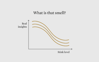
Smell Test for Data
-
Members Only

Misleading Map, or Misinterpreted? (The Process #72)
A 3-D rendered map of Australia depicting a month of bushfires grew popular last week. Some thought it misleading. Others thought it was okay. It’s probably somewhere in the middle of that.
-
Members Only
Setting Visualization Expectations to Avoid Audience Confusion (The Process #41)
People misinterpret charts all of the time, because they go in with the wrong expectations before they even fully interpret what a chart is about.
Recently for Members
Second Edition
 Visualize This: The FlowingData Guide to Design, Visualization, and Statistics (2nd Edition)
 Visualize This: The FlowingData Guide to Design, Visualization, and Statistics (2nd Edition)
New tools, refined process.
Browse by Chart Type See All →


