Paying attention to the visualization minutiae adds up. This week: axis positions.
axes
-
Members Only
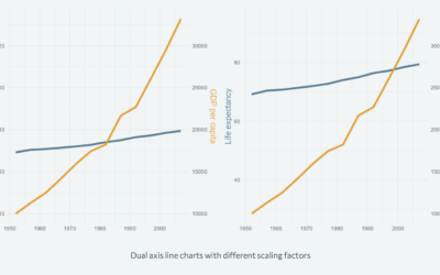
Switching axis positions
-
Improving axes on a chart
Nicola Rennie provides five quick tips to improve on default axis scales:
[T]he… -
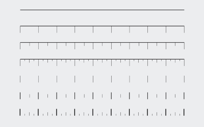
A rubber stamp for graph axes
For graphing on the go, Present & Correct offers a rubber stamp with…
-
Members Only
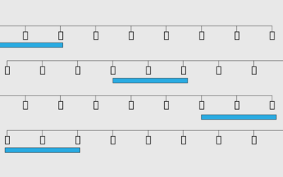
Setting Axis Ranges
Set the scales to highlight the changes in the data without abandoning the accuracy of the data.
-
Best visual illusion of the year
Our brains are pretty good at finding patterns, but it has some blindspots…
-
Members Only
Axis Labels, Better Than Defaults (The Process #38)
In this guide, I look maybe a little too closely at how to adjust axis labels for more readable charts.
-
Members Only
How to Customize Axes in R
For presentation purposes, it can be useful to adjust the style of your axes and reference lines for readability. It’s all about the details.
-
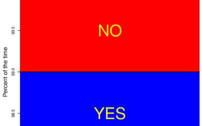
Baseline matters
Sweet, I guess Fox News had it right all along. I’m going to…
-
Too many axes
Kaiser Fung talks about the suck of overlaying plots to show a relationship.…
-
No axis labels
xkcd geekdom for your slow Monday afternoon. Can you imagine being with someone…
-
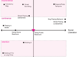
Axes of peeing in public
You might think this is a joke, but this is serious business. From…
-
Graph labels are for chumps
Yeah, it’s Friday.






 Visualize This: The FlowingData Guide to Design, Visualization, and Statistics (2nd Edition)


