Hawt. [Tokyotek via @datapointed]
-
-
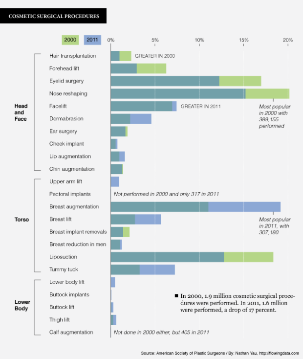
Many people aren’t happy with their face or body, and a proportion of those turn to plastic surgery to try to alleviate their displeasure. The American Society of Plastic Surgeons annual report shows just how many have opted for cosmetic surgical procedures. There were nearly 1.6 million of them performed in 2011, along with 12.2 million minimally-invasive procedures.
The above chart compares the distributions of the former from 2000 (shown in green) to 2011 (shown in blue). The two years are overlaid, and procedures are roughly organized by spot on the body. Breast augmentation led the way in 2011 with about 307,000 performed.
-
-
-
-
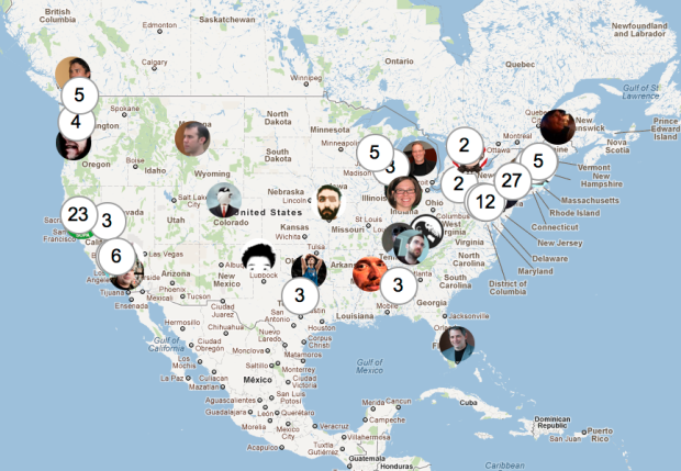
You’d think that this would’ve been done by now, but this simple mashup does exactly what the title says. Just connect your Twitter account and the people you follow popup, with some simple clustering so that people don’t get all smushed together in one location.
-
-
-
In a similar fashion to their work in Britain from Above, CGI and animation group 422 South map the daily patterns of those in the Netherlands in VPRO’s production of Netherlands from Above. It’s hard to get a grasp on what exactly I’m seeing, since I know next to nothing about the Netherlands and the video narration is in Dutch, but the visuals are beautiful. Planes fly, cars drive, and patterns emerge. The technique never seems to lose its entertainment value.
Check out the short making-of video, too, which also includes folks from Stamen describing their work with the interactive portion of the feature.
[422 South | Thanks, Ben]
-
-
-
-
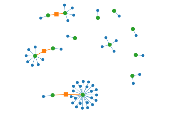
When you use the same password for every online account, there could be trouble down the line if one of those sites was breached. You gotta mix it up these days. As part of their Watchdog initiative, Mozilla released an add-on to help you see how you’re reusing passwords, and to hopefully keep your personal information secure.
Ever been told not to reuse the same password across different websites? With this add-on, you can visualize your passwords and the sites you use them on. By looking at this visualization, you can get a quick idea of which passwords you’ve been using the most, and the kinds of sites you’re using them on. As you continue to change your passwords and update your password manager, the picture will improve!
Personally, I don’t save any of my passwords. The risk of my computer getting stolen and some random person gaining access to my online accounts is too much for me to handle. Of course as a result, I have to put up with the craptastic experience of trying to remember passwords with a variable number of capital letters, symbols, and digits.
[Mozilla]
-
-
-
This talk by Bret Victor caught fire a few days ago, but I just got a chance to watch to it in its entirety. It’s worth the one hour. Victor demos some great looking software that connects code to the visual, making the creation process more visceral, and he finishes up with worhtwhile thoughts on the invention process.
-
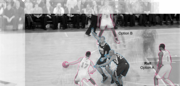
You knew this was coming, right? The New York Times describes the point guard fundamentals — dribble penetration, ball screen, and isolation — of Jeremy Lin in this animated Linfographic. For each play, the players of interest are outlined, and the frame shifts so that you can see where the players have been, relative to where they currently are. It’s a simple concept executed well.
I’m familiar with this stuff already, but I imagine this being pretty useful for people just tuning into the game, due to their sudden case of Linsanity. Today’s game against Dallas is gonna be a hot ticket.
-
-

Recently for Members
Browse by Chart Type See All →


Browse By Topic
Get the Book
 Visualize This: The FlowingData Guide to Design, Visualization, and Statistics
 Visualize This: The FlowingData Guide to Design, Visualization, and Statistics
Available now.